
By Matt Moran January 3, 2024

22 Best PowerPoint Color Schemes to Make Your Presentation Stand Out in 2024
There’s nothing worse than an amateur PowerPoint presentation. If you’re going into a business meeting or sales pitch, your presentation slides should look as professional as you do. That’s why choosing the right color scheme is so important.
In this post, we’ll be sharing a roundup of 22 of the best PowerPoint color schemes you can use to make your presentation look the part.
All the color schemes on this list have been incorporated into templates created by professional designers, so they’re super-stylish and guaranteed to make your slides stand out.
Whether you’re an educator looking for a color scheme that will keep your students engaged, or a business professional who wants to make an impact in your next meeting, you’re sure to find something suitable below.
Tips for Choosing the Best PowerPoint Color Schemes
Before we jump into the roundup, let’s talk about how to choose the right color scheme for your needs. Here are a few things to bear in mind when you’re comparing your options.
1. Use High Contrast Colors
When it comes to color, contrast is the number one most important consideration. Text, icons, and other important graphics on your slides need to be highly readable, so you need to make sure to use high contrast colors for these elements.
In other words, use a color with a significantly different tone/brightness from your background. Certain colors are inherently lighter/darker than others. For example, blue is much darker than yellow. As such, these colors tend to pair well together.
I’d also recommend never combining warm and cold colors, like bright red on bright blue or vice versa. This is because human eyes have trouble distinguishing interactions between the different wavelengths, which causes eye fatigue.
2. Consider Color Associations (Psychology)
People have certain subconscious associations with different colors. For example, people associate blue with trust, calmness, and reliability, which makes it a safe choice for business presentations.
Green is associated with nature, peace, and organic products, which might make it a good choice if you’re working on a sales pitch for an eco-friendly product.
Black evokes sophistication, seriousness, evil, and mystery, so it can work just as well for spooky Halloween lesson PowerPoints as for high-end fashion brand presentations.
Try to choose a color scheme that fits the kind of associations you want to make. If you’re working on a brand PowerPoint presentation, a safe bet is to stick with your brand colors.
3. Always Use Gradients
In nature, colors rarely appear in solid blocks – they transition gradually from one hue to the next and blend into each other.
Because we’re used to seeing colors naturally act this way, you should try to do the same in your PowerPoint presentations by blending colors into each other using gradients. Blocks of solid color can look amateurish.
The good news is that all the templates on this list are designed by professionals who understand this and therefore use natural color gradients to create a professional look.
4. Choose the Right Color Scheme for Your Screen Type
Finally, don’t forget to consider the screen you plan on showcasing your PowerPoint presentation on. Darker color schemes will look good on close-up screens like tablets and desktops. However, lighter colors work better for projections as they tend to be more readable.
In particular, never use red text if you’re projecting your presentation onto an external screen, as if any kind of unwanted ambient light/glare hits the screen, the color will wash out. In fact, it’s best to avoid any brightly colored text if you’re using a projector.
22 Best PowerPoint Color Schemes
Alright, let’s jump into the list. Below, we’ve listed our top 22 favorite PowerPoint templates with awesome color schemes.
1. Shades of Grey and Yellow – Our Top Pick
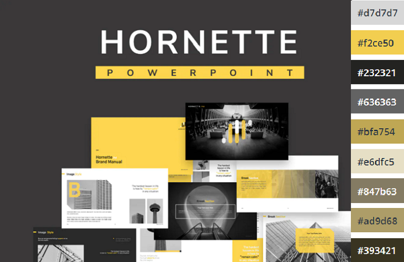
If you’re looking for a darker color scheme to use for a business presentation, you can’t go wrong with the Hornette template. Darker shades of grey and black strike a serious tone that befits a corporate environment, which is offset by bold yellow highlights.
We like how the high contrast between the darker shades and the bold yellow can be used to direct the readers’ gaze to the most important elements on the page and make key messages stand out.
The template itself includes 50 slides, including a gallery and portfolio slide, and features creative layouts and useful graphics. All graphics can be resized and edited.
2. Teal and White
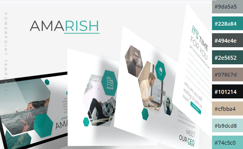
Teal is a color that blends blue’s dependability with green’s optimism and healing properties. The result is a calming, balanced color that’s packed with personality.
This multipurpose PowerPoint template uses teal alongside plenty of whitespaces and is perfect for business and personal presentations. All elements are fully editable, and if teal and white isn’t your style, you can pick another of the 5 included premade color schemes included.
3. Shades of Black

Dark themes are very on-trend right now. If you want to add a touch of sophistication to your presentation or strike a serious tone, you can’t go wrong with this Halbert PowerPoint template.
The all-black color scheme looks slick and elegant, and the white text is highly readable. This template works best when you don’t have to worry about room lighting, and might be a good fit for fashion presentations.
4. Color Fun
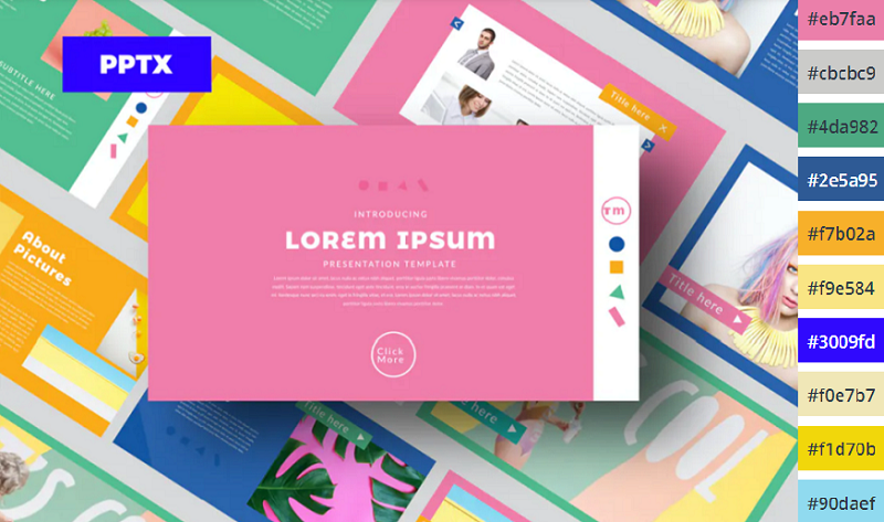
If you want something a little more upbeat, try this Color Fun PowerPoint template. It uses a wide color palette, which can help provide enough variety to better organize the different sections and elements on your slides.
It’s bright, upbeat, and sets a positive tone – without being too overwhelming. The designer has toned down the colors just enough that they’re not distracting and won’t cause eye fatigue.
5. Monochromatic Blue
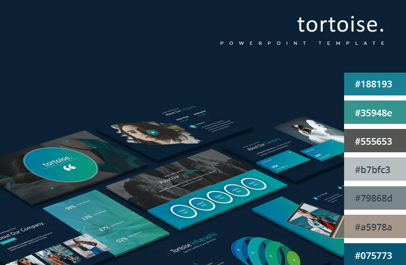
This Tortoise PPT template uses a mix of light and darker blues to create a stylish, professional look. The download includes 150 slides in total, split into 5 colors (30 slides per variation). All graphics included are fully editable and resizable in PowerPoint.
6. Minimalist Light Colors
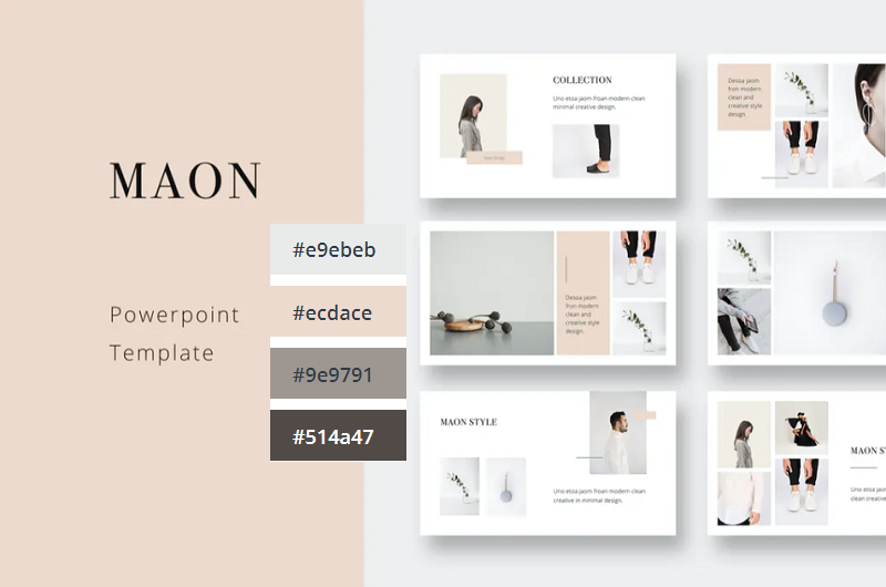
Bold and bright colors can work well but sometimes, it’s best to keep things simple. This clean and modern PowerPoint presentation follows the principle of minimalism, with very light shades like beige and pale green. It comes in a 1920x1080p format and includes a bunch of awesome icons and graphic elements that are fully vector editable.
7. Orange Burst
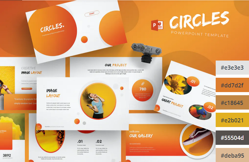
Orange is the most vibrant color in the color spectrum. It’s full of energy and life, so it’s perfect when you want to really get your audience excited about the contents of your presentation. This PowerPoint template from aqrstudio uses orange gradients alongside circular icons and graphics.
8. Yellows and Whites
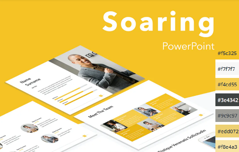
If you’re looking for a yellow template, check out Soaring by Jumsoft. It features an energetic, professional design and includes 20 master slides in the standard 4:3 side, as well as charts, diagrams, tables, and other awesome visual elements. You can choose the layout that’s most suitable for your content and customize more or less everything in MS PowerPoint.
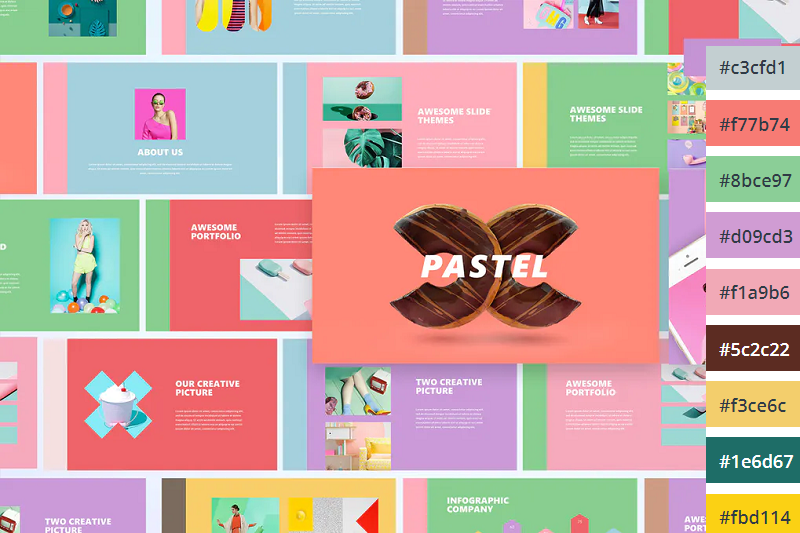
Pastels are the color trend of the year. These lighter, softer shades of colors have been embraced by younger generations like Millennials and Gen Z and have rapidly become associated with self-care for their ‘calming effect’. If you want to incorporate them into your PowerPoint color scheme, check out this pastel template by UnicodeID.
10. Organic Greens
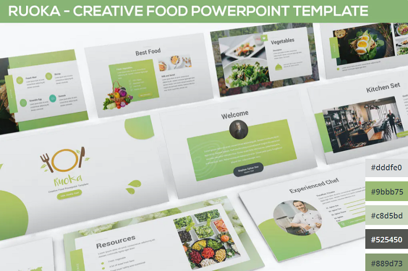
Working on a food-related presentation for a culinary business? Or perhaps you’re putting together a pitch deck on an environmental topic? Either way, this organic green PowerPoint template has the perfect color scheme for you. It’s ideal for health and nature-related slides.
11. Bold Red and Black
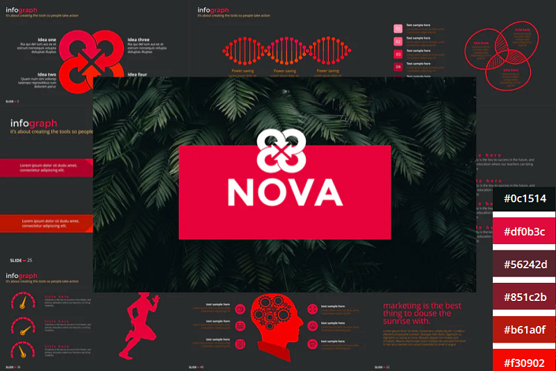
The NOVA PowerPoint template by Artmonk uses a stunning red-on-black color scheme. It’s a bold color combination that packs a punch, so it’s great for presentations in which you’re trying to break the mold and make a statement. It’ll look great on screens but might not show up well on projector displays due to the dark background.
12. Bright Multicolor

Here’s another awesome multi-colored palette that’s upbeat and fun. Wide color palettes like this are great for large slide decks as they give you a lot of options to choose from. I can see this one working really well for creative agencies and personal portfolios.
13. Lime and Dark Blue
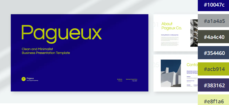
Blue and yellow is a classic combination. This lime and dark blue template offers a new twist on that classic combo to make it a little more exciting. If you already use dark blue as part of your brand color palette, this is a great template to use.
14. Pretty Pink
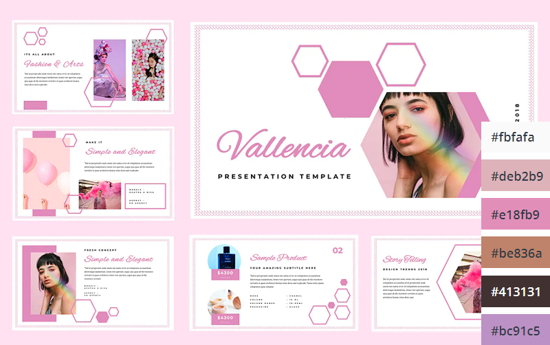
The Pretty Pink color scheme is perfect for creating feminine and youthful PowerPoint presentations. This would be perfect for female-oriented business products, or presentations about beauty, pop culture, and more.

Teal is the perfect color scheme for exuding wealth and intelligence. In color psychology, green connotes wealth and money, whilst blue evokes intelligence. Teal is the perfect blend of the two colors, which makes it a great choice for financial presentations and documentation.
16. Dark with Splashes of Color
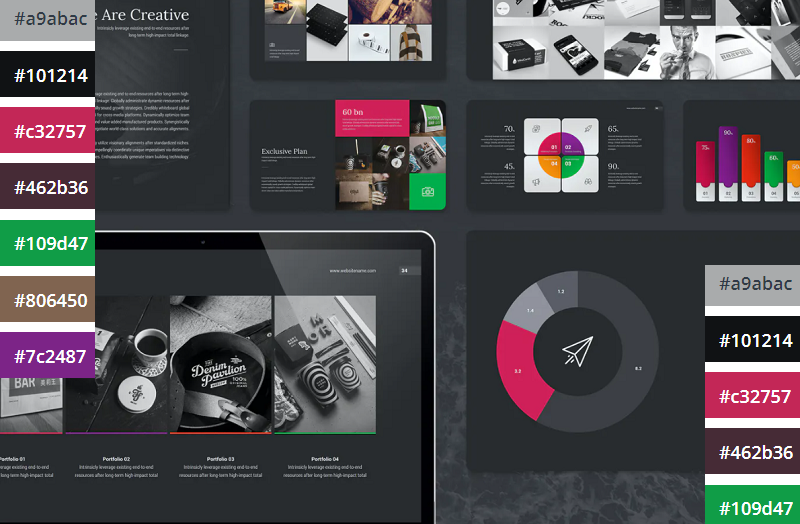
If you want a luxurious and ultra-modern color scheme, Black with splashes of color is just the ticket. The black creates a sleek and professional feel, whilst the bold and colorful highlights make the key information in your presentation pop.

Coral is a bold and vivid color scheme perfect for making an impact on your presentations. This PowerPoint template utilizes coral as the background of each slide which helps the text and other visuals to really stand out.
18. Classic Blue and White
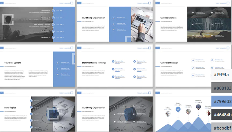
If you’re looking for a clean, modern, and professional color scheme for your PowerPoint presentations, you can’t go wrong with classic blue. The color scheme evokes professionalism and technological prowess and is perfect for tech businesses and startups. The Contact PowerPoint from Envato Elements is a great example of how this color scheme can be used.
19. Pinks and Purples
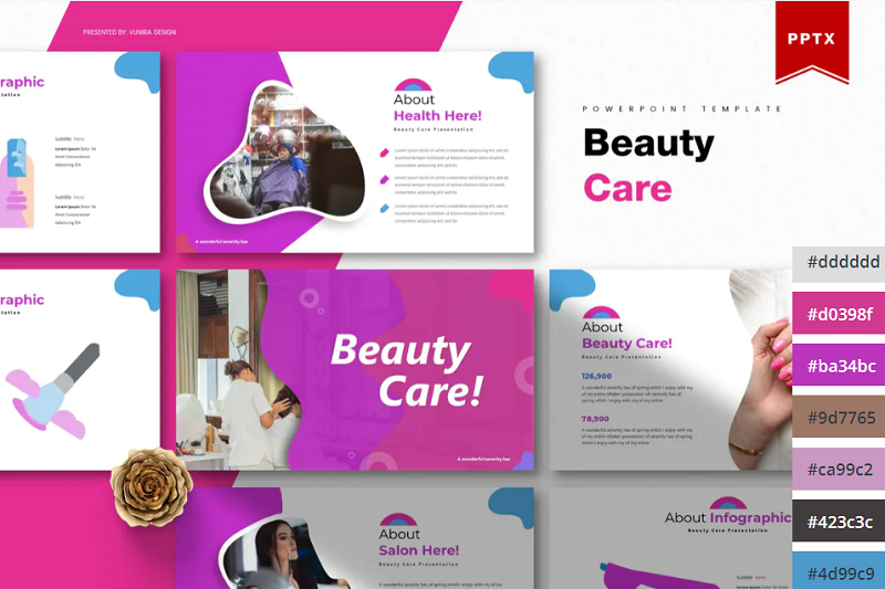
Pinks and Purples is a vibrant and feminine color scheme that would work perfectly for beauty brands and retail stores. The colors are bold and inviting and have a luxurious feel. This Beauty Care template from Envato Elements utilizes this color scheme as well as unique shapes to make for a visually interesting presentation.
20. Winter Watercolors
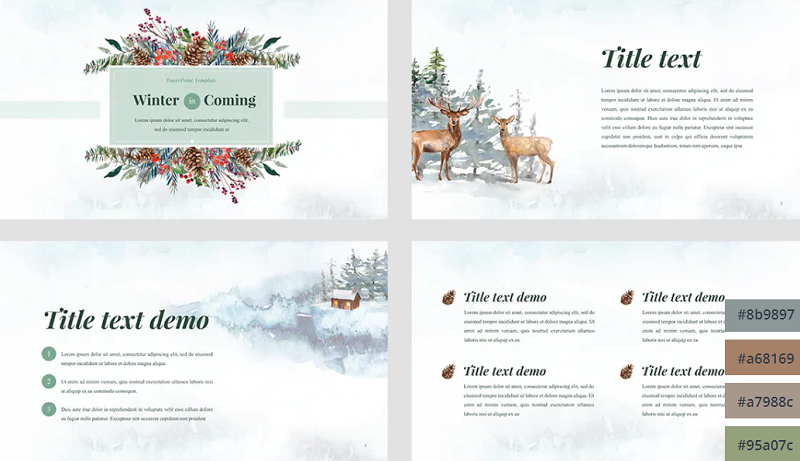
Winter Watercolors is a great color scheme for festive presentations. The muted, blue, and green cold tones are easy on the eye and evoke a homily feeling. This would be perfect for creating slideshows for Christmas parties or other winter-themed events.
21. Coral Highlights
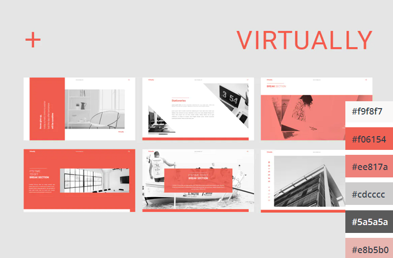
Unlike the last coral color scheme we looked at, which used a coral background with white text, this template uses mostly white slide backgrounds. Coral is used much more sparingly to highlight key elements on the slide. This gives the PowerPoint a more relaxed and feminine touch.
22. Primary Colors
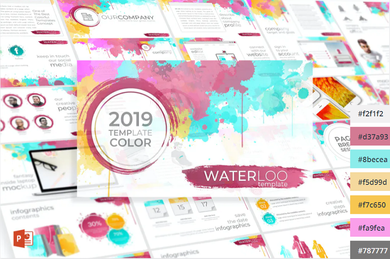
This Primary Colors color scheme is perfect for adding a vibrant touch to your presentations. This color scheme is a modern take on the classic colors of red, yellow and blue, and would be perfect for creating fun and engaging business presentations.
Related Posts
Reader interactions, droppin' design bombs every week 5,751 subscriber so far.
You have successfully joined our subscriber list.
Leave a Reply Cancel reply
Your email address will not be published. Required fields are marked *
Notify me of followup comments via e-mail. You can also subscribe without commenting.

- PowerPoint Design
- PowerPoint Training
- Presentation Skills Coaching
- Presentation Tips
Call Us. 202.681.0725
The Psychology of Color in PowerPoint Presentations
- April 12, 2013
- Kevin Lerner

Discover how the colors you choose for your PowerPoint presentations can guide the emotional response of your audience.
What are the best colors for a powerpoint presentation it all depends on who your audience is and what you want them to feel.
When used correctly, color can help audience members sort out the various elements of a slide. But its power goes beyond mere clarification. To some extent the colors you choose for your visuals guide the emotional response of your audience.
Blue: The most popular background color for presentation slides
Blue is one of the most common background colors. It’s calming and conservative, which is why it’s very popular with business presenters, as well as for for trainers. Studies have shown that blue has the power to slow our breathing and pulse rates. Dark blue backgrounds with light text are great for conservative corporate no-nonsense presentations. Lighter blue- more common in re cent times- work well in relaxed environments with the lights on, and help promote interaction.
Examples of BLUE in Presentations

- Quest Diagnostics: A serious company with a seriously navy blue background. The subtle angled lines promote a feeling a movement and technology. Blue complements the Green of Quest’s logo, and the white title bar provides a clean but stark contrast to the body.
- This blue template for waste management firm Republic Services provides a conservative backdrop for the financials and white bullet points. The yellow titles stand out, as does the orange, red and blue themed imagery at the bottom, not to mention the company’s logo.
- This slide for Dr. Soram Khalsa’ Complementrix Vitamin system features a template with a dark blue with angled lines. And the inner portion of the template featured a light blue-hue burst of a sun-ray to convey bright life and energy.
- This slide for Lender Direct featured an image of a file folder, edited in Photoshop, with a 80 % transparency set against a light blue background. The light blue graphic helped to convey a sense of openeness , and professionalism, while maintaining the company’s blue brand.
Green: Stimulates interaction and puts people at ease

Green stimulates interaction. It’s a friendly color that’s great for warmth and emotion. Green is commonly used in PowerPoint presentations for trainers, educators, and others whose presentations are intended to generate discussion. It’s also a great color for environmental and earth-oriented discussions.
Examples of Green in Presentations

- This slide for Hills Pet Nutrition features a modern green background with textured lines promoting a warm, but contemporary feeling. Great for their topic on pet affection.
- Money is green and so is this presentation for Presidio Finance. The white text contrasts nicely with the forest green finance images, helping to project a no-nonsense image of success and accomplishment.
- In this slide for TD Waterhouse, we created top title bar in dark green, integrating smoothly with their lime green logo. The green-hued process chart on the slide image stands out comfortably against the textured grey background.
- The flowing green arcs at the bottom and green title text helps substantiate this slides message of health and vitality. Executive Success Team’s green logo and brand also promotes a relaxed and comfortable feeling, just like Mona Vie.
Red: Handle with Care in Presentations!
Red is one of the most influential colors in your software palette — but it also carries negative cultural attachments, so use it carefully. Red is also a great color for conveying passion. Or talking about the competition. Do not use Red in financial information or tables and charts.
Examples of RED in Presentations

- The rich red of Oracle is maintained in this template, featuring red title text in an inset red rectangle and a red bottom bar of binary numbers for a look of blazing edge technology
- Trace Security uses a similar red title bar element, tying in to their black and red logo and brand.
- Red and black are also colors for Sales Training Consultants, and in this slide, we used a flat beige background, with a title bar in bright red together with red bullets and a red target graphic.
- The body pages of the Grenada presentation feature Red, but in an inset border. Text is inversed in white, as is the main body area. The key states in this map are highlighted in red.
Purple: Mystical and Emotional color in presentations and design
Purple is often associated with royalty and wealth. Purple also represents wisdom and spirituality. Purple does not often occur in nature, it can sometimes appear exotic or artificial. Nearly all the clients who come to me with presentations featuring purple or lavender are women. It’s a feminine color and it’s a good color for emotional or spiritual presentations.
Examples of Purple in Presentations

- Crosley & Company’s branding is maintained with a dominant dark purple background, and orange titles.
- A soft lavender background option gives these two medical doctors a chance to add some warmth for their mostly women audiences.
Yellow, Orange, & Gold: Attention-getting colors of affluence and prestige
Yellow can create feelings of frustration and anger. While it is considered a cheerful color, people are more likely to lose their tempers in yellow rooms and babies tend to cry more in yellow rooms.
Since yellow is the most visible color, it is also the most attention-getting color. Yellow can be used in small amount to draw notice, such as key words, or highlights but not in backgrounds. Rather than using flat yellow as a background color, consider a more “golden” or orange color. Simply adding texture to a yellow background or superimposing a photo (in Photoshop) with low transparency, can add more richness to the yellow background image.
Examples of Yellow / Gold in Presentations

- This flat yellow slide is for Web-Reach, an internet consulting firm in Miami. Even though their message was to compete with the Yellow Pages phone book, their yellow background was flat and uninspired.
- With a simple fix in Photoshop, yellow became Gold, and the same slide became more robust. We added a red bar to the top, and a grey arc to the left. Same information, just a textured golden hue helped deliver elegance and style.
- A golden textured earth background helped this slide convey the message of international elegance. The green money background blends with the gold, and the black text brings a nonsense message to the page.
- A golden textured background for Fountainhead Consulting with elements of yellow, blue, red, and grey.
Black: A strong and definite color that’s often overlooked!
Don’t forget your basic black. Often overlooked, black is a background color with useful psychological undertones. Its neutrality makes it a good backdrop for financial information. Black connotes finality and also works well as a transitional color which is why the fade to black transition is powerful, as it gives the impression of starting fresh.
Examples of Black in Presentations

- It’s a matter of black and white for this construction company. It’s intro slides were pure white text on a black background, emphasizing the company’s core beliefs. After the 3 b&w slides, the room lit-up with a series of dynamic colorful slides as the speakers enlightened the audience.
- Over 10 years old, this slide from Ryder transportation remains one of the strongest visuals. Set against a flat black background, the company’s grey logomark conveys a true sense of stability and no-nonsense action. The monotone building blocks tell a strong story.
White: Pure, Fresh and Clean. But a little boring.
White is also a calm and neutral color for presentations. It’s terrific for conveying a fresh start such as a fade to white. It represents purity or innocence. Good for positive information where you want the focus purely on the message, and not competing with a brand image. It’s clean/open and inviting and can create a sense of space or add highlights. But it can also be perceived as cheap, flat (it’s the default color for PowerPoint slides) and harsh on the eyes. Consider grey as a better background color.
Examples of White in Presentations

- To help to maintain a clean and open look this consumer collaborative called on us to integrate their brand colors set against a plain white background. The blue and orange bars provided a conservative frame, while the arcs provided a contemporary look of flow and motion.
- This slide for a large architecture and construction firm featured a flat white background offset by a colorful series of modern buildings and logos.
Grey and Silver: A conservative color; Good when Black or White won’t work.

According to psychologists, grey is often thought of as a negative color. It can be the color of evasion and non-commitment since it is neither black nor white. Some say that Grey is the color of independence and self-reliance. A few years ago, silver was the most popular color for cars. And in the presentation world, this calm color is making a comeback. Grey (or “Silver”) is a softer background than the harsh default color of white, and works well on almost all presentations. A dark grey background with light text…or light grey background with dark text…you can’t go wrong!
Examples of Grey in Presentations

- Farmers Insurance’s silver background integrates subtle ray of light elements to help add depth and texture to this slide. The red, blue, and black stock images blend comfortably with the rest of the page. And the white border around the letters add a level of modernism and clarity.
- The stainless steel background of this slide helps promote a modern contemporary look, helping to link the 4 brands together.
- A clean flowing blue arc with a non-obtrusive silver background help make this slide for Margie Seyfer appear fun but conservative
- Interim Healthcare’s brand is maintained, but a muted image in silver help add depth and dimension to the slide’s message, while supporting its key points.
We perceive dark colors as being “heavier” than light ones, so graphic elements that are arranged from darkest to lightest are the easiest for the eyes to scan. On charts, it’s best to arrange colors from dark to light.
Remember that most eyes aren’t perfect. Because color perception deficiencies are common, certain color combinations — including red/green, brown/green, blue/black and blue/purple — should be avoided.
color , powerpoint , powerpoint tips , presentation design , psychology of color , style
Presentation Perfection for Clients around the World.

"We engaged The Presentation Team to do a Presentation training for our team and he did a great job. He spent time understanding our requirements and the skill level of our team members and created a course which met our expectations and goals. I highly recommend The Presentation Team as a Presentation (PowerPoint) trainer."
Navdeep Sidhu Senior Director, Software AG
"Kevin Lerner provided best-in-class services when hired to work on promotional materials for the launch of a key product at Motorola. The expertise and quality that he brought to the project were second to none and as a result, he delivered a top-notch presentation that was quickly adopted throughout the organization. Kevin is great to work with, delivers on time, is a great team player and is always willing to go the extra mile."
Maria Cardoso Motorola
"Kevin has been a working with Cox Communications to deliver world-class PowerPoint presentation visuals since 2009. His ability to meet our specific needs, timeframe, and budgets has been exceptional. His professional interaction with our team reflects his deep expertise in the industry, superior presentation design skills, and commitment to superior service."
Jonathan Freeland VP, Video Marketing at Cox Communications
"Kevin is an enthusiastic, creative, and passionate presentation guru. Our company was impressed and felt the value of his training in 2013 that he was invited again recently to again share his knowledge. Both times he has been energetic and addressed many areas for presentation development. From planning to follow-up Kevin is personable and easygoing, motivating our teams to take their presentations to the next level."
Yoshimi Kawashima Project Coordinator, Nissin International
"Kevin helped me immensely improve my presentation slides development, from tips & tricks to aesthetics, all with the intent of getting the message across crisply and creatively. I've already received praise for decks that incorporate the skills obtained from his training. I highly recommend Kevin's services."
Era Prakash General Electric
"Kevin helped me immensely improve my presentation slides development, from "The PowerPresentations seminar opened my eyes to all the limitless possibilities in presenting."
Leah Gordillo Saint Francis Medical Center
"Kevin helped me immensely improve my presentation slides development, from "[Kevin and The Presentation Team have] always delivered 110% in terms of meeting our objectives for finished product and budget"
Paul Price Watsco Corp.
"I had more people come up to me after I spoke, commenting on the visuals you created, than I did on the subject matter!"
Andy Smith Smith & Robb Advertising
"As a Fortune 1000 company, we sought to produce a classy, yet conservative presentation for our shareholders. It was evident that you and your team listened to our thoughts as you developed the presentation..."
Will Flower Republic Services
"Your expertise in the filed of PowerPoint and general presentation techniques helped elevate us to the level necessary to beat the competition."
Mike Geary James Pirtle Construction
"Kevin brought a high level of creativity, enthusiasm, and deep multmedia experience to our team. He worked dillegently with the team to produce an outstanding proposal which we subsequently won.
Jeff Keller Accenture/L3
info @ presentationteam.com
Giving a Presentation? We can Help.
Sign-up for free PowerPoint Tips, PowerPoint Templates, and Presentation Strategies.
The 10 Best PowerPoint Color Palettes You Should Use [+1 Template]
Presentations have evolved over the years, and have now reached a stage where every element that is used can help make an impact or completely disassociate from the audience. To ensure that your presentations are on the former half of the spectrum, make sure that you are using the right PowerPoint color palette in their appropriate scenarios.
Colors are often some of the most overlooked factors of a presentation, with most presenters looking to go with “something that looks nice.” However, colors play a more important role than you may have imagined and deeply impact how your audience will react to your presentation.
The 10 Best PowerPoint Color Palettes
Every presentation needs you to use colors according to the type of presentation it will be. For example, if you are going to pitch a project to investors, you need your colors to be full of energy. Still, in retrospect, if you are presenting in front of a room full of professionals on a topic they know about, you need colors that ooze professionalism and are cool colors!
To help you find a color palette that fits your energy needs, we have created a list of the ten best PowerPoint color palettes with their hex codes!
1. Energizing Presentation Color Palette
Color Code: #4D74FF · #FF5128 · #050007 · #EFFFF

One presentation color palette that you should keep handy when creating any slideshow that requires you to portray energy is the orange, blue, black, and white combo! The orange color helps promote energy and create an upbeat feel to the presentation, while the blue helps keep your audience engaged during a long presentation.
The ice-white and pitch-black color combo also helps keep your text readable and crisp. This scheme is best for when you want to have a pitch meeting.
2. Reliable Color Palette For Presentations
Color Code: #343752 · #90ACC7 · #FAD12B

Blue is one of the most commonly used colors in businesses as it screams out ‘trustworthy and calming, yet it’s so monotone. But, when combined with yellow and a companion darker blue color, you end up creating a reliable PowerPoint color palette that you will keep on going back to when you need a color scheme to fall back on. This color scheme can be used for purposes like branding and marketing.
3. Confident PowerPoint Color Palette
Color Code: #F8275B · #FF574A · #FF737D · #3D2F68

To boost confidence within your audience while presenting, you must use this color scheme that contains the color red!
When using red in presentations, one thing to keep in mind is that red is a very aggressive color when alone; that’s why you should pair it with softer colors, like a softer tone of orange, pink, and Fuschia.
4. Fun Corporate Presentation Color Scheme
Color Code: #3B4D54 · #B9BAB5 · #FE8D3F

All of us can agree that corporate presentations can be a bore, especially when with all the boring gray and dark colors. To create a corporate slideshow that is also fun at the same time, you should add bright colors, like orange, to your gray-tone colored presentation.
The bright color helps add a pop to your presentation and keep it serious, enabling you to keep your audience engaged and attentive!
5. High-End Color Palette For Presentations
Color Code: #5D1D2E · #951233 · #C15937 · #997929

One of the best themes to use for your presentation has to be the vintage color schemes! This 1930s color scheme uses colors such as dark brick red, copper, olive green, and wine red to give your presentation an elegant mood that makes your slideshow look expensive. This color scheme is best suited for luxury goods presentations!
6. Modern Palette For Presentations
Color Code: #5EA8A7 · #277884 · #FE4447

When talking about good color palettes for presentations, the modern color palette is among the first to come to mind. The palette uses bright colors like red over muted colors like dark and light cyan.
The bright color adds a pop to your slides, which helps keep the audience refreshed throughout the presentation. This color scheme is best used to create a presentation that balances business and energy with modernity.
7. Calming Presentation Color Scheme
Color Code: #C5DE82 · #7C3A5F · #FD8C6E · #98ACB5

When creating a calming presentation, one thing to keep in mind is to use colors that help soothe your audience. You can use colors that are found in nature, like spring green, blue-gray, terracotta, and mulberry purple, to help create that soothing effect, as shown below!
This color scheme is best suited for health and mental well-being presentations; it can be used by hospitals and companies present in the health sector.
8. Professional Presentations Color Palette
Color Code: #6B90B2 · #1B558E · #CCD64D

Make your presentation look professional while keeping it refreshing and fresh using this professional color scheme. This palette combines dark and desaturated blue with a lemon-like yellow.
The yellow adds a fresh look to your slides, while the blue colors help keep your presentation looking professional. These colors suit slides requiring you to break important news or build trust with your audience.
While talking about professional slides, if you find it difficult to create visually appealing slides, check out our professional PowerPoint templates that are 100% customizable, enabling you to edit the template according to your requirements.
9. Creative PowerPoint Color Schemes
Color Code: #02AA9D · #3187DE · #FE951C · #FF88AC

Add a bit of creativity to your presentations with the help of bright colors that help catch your attention and invoke the feeling of experimentation. It creates a fun and creative color palette when combined with tropical colors.
Bright colors, like orange and pink, help bring a warm tone to your presentation, while tropical colors, like viridian green and blue, help keep your presentation creative! This color scheme is best suited for brainstorming sessions.
10. Warm Presentation Color Palette
Color Code: #A49393 · #EED6D3 · #E8B4B8

Last but not least, we have the warm color scheme on our list of the best presentation color schemes! Best suited for cosmetics and fashion sector presentations, this palette uses warm neutral colors, like different light and dark tones of red. Using neutral colors allows your slides to be versatile and can be paired up with almost anything, and warm neutral colors help keep your presentation looking sophisticated and warm.
These were some of the best color schemes that you should use for your next presentation. It’s finally time to say goodbye to plain slideshows and wow your audience with the perfect color palette. If you are trying to experiment with the color palettes, check our blog on the one color never to use in presentations to ensure you are doing everything correctly when creating your own scheme.
Take a loot at our presentation design services if you need help designing your presentation. Our team of design experts helps create and tailor slides according to your needs, enabling you to focus on things that matter, like the content and speech delivery. Here are some more examples of well-designed PowerPoint slides.
SlideUpLift’s Collection Of Professional PowerPoint Templates

What is the best color scheme for PowerPoint?
The best color scheme for PowerPoints ensures readability, maintains a professional look, and complements the content of your presentation. A balanced color scheme combines neutral backgrounds (like white or light gray) with contrasting text and accent colors. Blue and green tones are often favored for their professional and calming effects, while red can be used sparingly for emphasis.
What is the 60-30-10 color rule in PowerPoint?
The 60-30-10 color rule is a classic design principle that helps create visually appealing and well-balanced presentations. It dictates that you should use:
1. 60% of a dominant color : This is usually the background color and sets the overall tone of the presentation.
2. 30% of a secondary color contrasts with the dominant color and is often used for elements like charts, graphs, or images.
3. 10% of an accent color : This is used sparingly to highlight important points or call-to-action elements. The accent color should stand out against the other two colors to draw attention where needed.
What is the best color for accessibility in PowerPoint?
The best colors for accessibility in PowerPoint ensure high contrast between text and background, making content readable for everyone, including those with visual impairments.
It’s crucial to use dark text or light text on dark backgrounds to achieve this. Additionally, avoid color combinations that are difficult for colorblind individuals to distinguish, such as red-green or blue-yellow.

How do I decide on my color palette?
Deciding on a color palette for your PowerPoint involves understanding your audience and purpose, choosing a base color that aligns with your brand or desired mood, and selecting complementary colors using the color wheel. It’s important to ensure contrast and readability by testing colors on different screens and considering color psychology to evoke the right emotions. For instance, blue can convey trust and professionalism, while red signals urgency. Online tools like Adobe Color, Coolors, or Canva’s Color Palette Generator can also help create harmonious color schemes. By following these steps, you can develop a color palette that enhances your presentations’ effectiveness and visual appeal.
Table Of Content
Related presentations.

SWOT Analysis PowerPoint Template

Mission Vision OKR PowerPoint Template

Aesthetic Title Slide Template
Related posts from the same category.

10 Dec, 2024 | SlideUpLift
Top 10 Hacks On How To Make PowerPoint Presentation Attractive
Per experts, the audience gets hooked and pays more attention to the visual content of your PowerPoint slides than drab-looking, text-heavy content. This article answers the well to know question

9 Dec, 2024 | SlideUpLift
OKR Meaning: Unlocking the Power of Goal-Setting for Business Success
As the legendary author and all-time celebrated management educator Peter Drucker says, “What gets measured, gets managed.” As an ambitious entrepreneur and professional, it is wise to understand that hitting your

25 Nov, 2024 | SlideUpLift
Make Your Slides Talk With PowerPoint Text To Speech!
Can PowerPoint read to you? Absolutely! PowerPoint Text to Speech is the tool that makes slides speak the content on your presentations! Being a professional, you know presentations are not

22 Nov, 2024 | SlideUpLift
How to Create A Personal Timeline [With Examples]
Ever felt like your life is a whirlwind of events, a chaotic jumble of memories? Well, let's untangle that mess and turn it into a beautiful, organized masterpiece. Having a
Related Tags And Categories
Forgot Password?
Privacy Overview
Necessary cookies are absolutely essential for the website to function properly. This category only includes cookies that ensures basic functionalities and security features of the website. These cookies do not store any personal information
Any cookies that may not be particularly necessary for the website to function and is used specifically to collect user personal data via ads, other embedded contents are termed as non-necessary cookies. It is mandatory to procure user consent prior to running these cookies on your website.
Find the images you need to make standout work. If it’s in your head, it’s on our site.
- Images home
- Curated collections
- AI image generator
- Offset images
- Backgrounds/Textures
- Business/Finance
- Sports/Recreation
- Animals/Wildlife
- Beauty/Fashion
- Celebrities
- Food and Drink
- Illustrations/Clip-Art
- Miscellaneous
- Parks/Outdoor
- Buildings/Landmarks
- Healthcare/Medical
- Signs/Symbols
- Transportation
- All categories
- Editorial video
- Shutterstock Select
- Shutterstock Elements
- Health Care
- PremiumBeat
- Templates Home
- Instagram all
- Highlight covers
- Facebook all
- Carousel ads
- Cover photos
- Event covers
- Youtube all
- Channel Art
- Etsy big banner
- Etsy mini banner
- Etsy shop icon
- Pinterest all
- Pinterest pins
- Twitter all
- Twitter Banner
- Infographics
- Zoom backgrounds
- Announcements
- Certificates
- Gift Certificates
- Real Estate Flyer
- Travel Brochures
- Anniversary
- Baby Shower
- Mother’s Day
- Thanksgiving
- All Invitations
- Party invitations
- Wedding invitations
- Book Covers
- Editorial home
- Entertainment
- About Creative Flow
- Create editor
- Content calendar
- Photo editor
- Background remover
- Collage maker
- Resize image
- Color palettes
- Color palette generator
- Image converter
- Contributors
- PremiumBeat blog
- Invitations
- Design Inspiration
- Design Resources
- Design Elements & Principles
- Contributor Support
- Marketing Assets
- Cards and Invitations
- Social Media Designs
- Print Projects
- Organizational Tools
- Case Studies
- Platform Solutions
- Generative AI
- Computer Vision
- Free Downloads
- Create Fund

10 Color Palettes to Nail Your Next Presentation
Bring your a-game to your next pitch meeting with these sure-to-dazzle color palettes..
Color is a powerful design tool. The right scheme can energize and motivate, soothe and inspire. With that in mind, we’ve put together a batch of ten eye-catching color palettes, each intended to have a different psychological effect on your presentation audience.
Perhaps you’re a young startup and need to excite potential investors , or maybe you want to ensure that viewers remain focused on important data. Whatever the style of presentation or pitch, you’ll find a color palette that suits your presentation needs in the list below.
- Introducing Creative Flow on Shutterstock Enterprise
- 7 Creative Tips for When You’re in a Slump
Simply take a note of the HEX codes in these inspiring color palettes, and apply your swatches to backgrounds , typography , or sales presentation templates for your next PowerPoint presentation or Google Slides pitch.
Now, let’s get started! It’s time to nail that pitch.

License this image via Pikoso.kz .
What Are the Best Colors for Presentations?
The best colors to use in PowerPoint , Google Slides, and other presentation software can vary widely depending on your audience, brand, and what you’re trying to achieve with the presentation.
A pitch for a new client might require exciting, inspiring color choices that help your audience to feel energized , while a data-heavy presentation to long-standing investors might require a more stable and reassuring color scheme.
- 10 Psychological Color Palettes to Win Friends and Influence People
- How to Use the Color Wheel to Build a Brand Palette
Below, you’ll find 10 color palettes for presentations that tap into the power of color psychology , helping you to choose colors that will always work in your favor.
These stylish color palettes can work for a variety of presentation purposes, like corporate reports, brand launches , and Q1 forecasts.
Scroll down to find the perfect presentation palette to help you bring the power of color to your next pitch.
1. The Perfect Color Palette to Energize Your Audience
Orange has been proven to promote energy and appetite in viewers, so it’s the perfect color choice for presentations that need to have an upbeat feel.
To keep your audience engaged throughout a long presentation, it helps to balance orange’s energy with the soothing, expansive mood of violet blue .
Blue-sky thinking is blue for good reason—this is a color that provokes inspiration and openness to new ideas.
To keep your energized palette crisp and clean, turn to ice white and pitch black to ensure your text remains crisp and legible.

2. The Best Color Palette to Calm and Reassure the Room
Sometimes, it’s more important to calm and reassure your audience than to energize or surprise them. Presentations focused on mental well being , health , or wellness wouldn’t benefit from a neon palette , for example.
Instead, bring a zen mood to the boardroom with this palette of soothing hues. Spring green , mulberry purple, terracotta, and blue gray have a grounding effect and mimic the soothing colors found in nature to create an ultra-relaxing effect.

3. The Perfect Color Palette to Boost Confidence
Red is traditionally the color of confidence, proven to make viewers feel stronger and more self-assured in its presence. However, pure red can be overtly aggressive, and the forceful effect of the color can be heightened on bright screens. Much better to temper red’s aggression with softer red orange , fuchsia , and shell pink .
This is still a highly confident palette with its graduation of warm hues, and its assertion is even stronger when paired with mysterious and authoritative plum purple .

4. The Best Color Palette to Appeal to Corporate Businesses
This color scheme gives a nod to the traditional palettes of the financial and legal world. Bottle green and cognac brown are teamed with dark racing-green and old gold for an established and luxurious effect.
Corporate presentations can be difficult to enliven, as they require a degree of formality and convention. However, this palette steps away from oft-used navy blue toward something more interesting.
Evocative of leather and velvet, this is a cocooning and moneyed palette that will help corporate clients feel like you understand their formal world.

License this image via AlonaPhoto .
Related Resources
- Colors – Color Schemes, Complementary Colors
- Color Palette Generator – Generator, Color Wheel, HEX Color Picker
- Golden Orange Color – Combinations, HEX Code
- Neon Green Color – Combinations, HEX Code
- Ink Blue Color – Combinations, HEX Code
- Hot Pink Color – Combinations, HEX Code
5. The Best Palette to Look Cool and On-Trend
Many startups, entrepreneurs, and young brands want to appeal to Gen Z audiences , and they need to have a cool color palette to match.
Whether you’re presenting a new product launch or looking to entice an on-the-pulse angel investor, this violet and neon palette will cement your cool credentials.
Look to urban colors, such as neons and grays, to create presentation slides with an ultra-cool mood.
This urban-inspired presentation palette combines deep and inky violet with acid lime yellow for a high-contrast effect, while concrete gray and moody black provide a neutral offset.

6. The Perfect Color Palette to Look Innovative
Young companies or startups pitching for their first round of investments need a palette that will communicate a spirit of innovation and fresh thinking. A perfect color palette for tech businesses or science startups, this palette has a futuristic, forward-looking mood.
Purple is the most intellectual and mysterious of all colors, making it a good fit for businesses offering something a little different from the norm, especially in the tech sector .
Neon pink is an unexpected choice for work presentations, but here it’s the perfect companion to purple and violet blue, bringing energy and a youthful mood.

7. The Best Color Palette to Appear High-End
Elevate your high-end presentations with this luxurious color scheme that borrows from vintage color schemes of the 1930s and 1940s.
If you’re pitching for a high-end brand or simply want to bring an elegant mood to your presentation slides, this claret and copper scheme will help your PowerPoint templates feel opulent and expensive.
Dark brick red and olive green are traditional establishment colors that give a nod to beautiful brick architecture and vintage uniforms.
This affluent color palette would also be a good fit for the hospitality, travel, or luxury goods sectors. Team with metallic backgrounds and crisp white text for simple luxury.

8. The Best Color Palette to Improve Focus
If you have vitally important data or a specific message you want your viewers to remember, consider this presentation palette of focus-promoting colors that will prevent your audience from mid-pitch window gazing.
Blue and green are the two colors most associated with improving focus and concentration, with blue promoting expansive thinking and green providing a harmonic, nature-inspired mood.
In this business color palette, rich teal combines both of these hues for a serious focus hit. Earthy burnt orange prevents teal from feeling lethargic, while giving the palette a grounded edge that feels serious and cerebral.

9. The Best Color Palette to Promote Sustainability
As sustainability is a central concern for many businesses today, it might be in your interest to give your presentations an environmental edge.
While businesses are often advised to avoid greenwashing , for the purpose of presentations, green is still the most reliable color for communicating environmentally-themed messages. It helps to immediately situate your audience within an eco-friendly mindset .
Whether you want to discuss how your company can become more eco-friendly or promote a sustainable product to a potential buyer, this fresh and verdant palette will give your slides a nature-inspired mood.
Emerald green , sage, and deep bottle green are made crisp and contemporary when teamed with chalk white.

10. The Perfect Color Palette to Boost Creativity
We could all do with a little more creativity in our working day, and you can turn to selective color choices to boost your weekly brainstorming session.
For presentations that need to appear creative or boost the creative potential of your audience, bright colors are stimulating, expressive, and promote a sense of childlike play and experimentation.
This is a colorful pick-me-up scheme for work-weary souls—a perfect presentation color palette for team-building days, ideation sessions, or for subjects that are more outside-the-box than usual.
Orange and pink perk up the palette with warm tones , while viridian green and azure blue bring a fresh, tropical feel to this fun, creative color palette.

License this cover image via VISTA by Westend61 .
Recently viewed
Related Posts

Why ElevenLabs Leveraged Shutterstock’s Rich Data to Build Its Groundbreaking AI Sound Effect Generator
ElevenLabs used Shutterstock’s diverse sound effects to power its AI…

How Reka Uses Shutterstock Data to Create State-of-the-Art Multimodal AI Models
What happens when a company needing rich metadata for its…

Regulation vs. Innovation: How Shutterstock Is Helping Pioneer Ethical Generative AI Models for Creators
Shutterstock consistently strives to support both creators and businesses. This…

How Shutterstock Aims to Help Shape the Next Generation of Filmmakers Alongside MIHI
Shutterstock and Pond5 are thrilled to announce an exciting expansion…
© 2023 Shutterstock Inc. All rights reserved.
- Terms of use
- License agreement
- Privacy policy
- Social media guidelines
7 Things To Keep In Mind When Selecting The Best Colors For Your Presentation
- By Judhajit Sen
- May 8, 2024
The impact of colors on slide presentations is profound. Colors don’t just about make slides look pretty; they influence how your audience feels and understands your message. Different colors evoke various emotions and associations. For instance, red can express urgency or danger, while blue can evoke calmness and trust.
Choosing the right colors is crucial. For instance, a pitch to new clients might need exciting colors to energize them, while a presentation to long-standing investors might require stable and reassuring hues.
Professionalism is key. Amateurish presentations can tarnish your image. Your slides should match your professionalism, making color selection vital.
But it’s not just about aesthetics; it’s about conveying information effectively. High contrast between background and text aids readability, while low contrast can hinder comprehension. Striking the right balance ensures your audience grasps your message effortlessly.
Color choice impacts perception. It aids retention and enhances visual appeal, making your presentation memorable. Whether you’re restricted by brand colors or have the freedom to choose, picking the right palette is essential for success. So, ensure your color scheme reflects your message and captivates your audience, setting the tone for your presentation’s success.
Key Takeaways
- Branding : Incorporate your company’s color palette to maintain brand identity and convey a consistent message.
- Readability and Contrast : Prioritize high contrast between foreground and background colors for optimal device readability.
- The 60-30-10 Rule : Balance dominant, secondary, and accent colors using this straightforward guideline for harmonized color proportions.
- Color Psychology : Understand how colors evoke emotions and perceptions to convey your message strategically.
- Color Groups : Differentiate between warm and cool colors to avoid mixing across groups and prevent visual discomfort.
- Color Schemes : Choose color combinations that suit your audience and setting, prioritizing readability and consistency.
- The Color Wheel : Utilize this tool to grasp color relationships and categories, guiding your selection process for cohesive presentations.
Seven Things to Remember When Selecting the Best Colors for Your Next Presentation

Incorporating branding elements into presentations is vital for conveying a consistent message. Start with your company’s color palette, ensuring it complements the logo and brand colors. This cohesion reinforces brand recognition without overpowering the message. For instance, HubSpot subtly integrates its signature orange across presentation slides, maintaining brand identity without overt logos.
Even with predefined templates, understanding color selection remains crucial. You may need to choose colors for visuals to ensure text clarity, enhancing comprehension within brand guidelines.
Colors wield psychological influence, shaping perceptions and emotions, thus becoming integral to branding and marketing strategies.
Consistency reinforces professionalism. Use consistent color schemes, fonts, and layouts throughout presentations to strengthen your message, identity, and credibility. Aligning with brand colors fosters trust and familiarity, which is essential for audience engagement and recognition . Whether using predefined palettes or online tools, maintaining brand-aligned consistency enhances presentation effectiveness.
Readability and Contrast

Creating slides with optimal readability and contrast is crucial for effective communication. When choosing colors, prioritize high contrast between foreground graphics or text and the background to ensure clarity and visibility. This contrast not only enhances readability but also aids individuals with color blindness in distinguishing content.
Using light and dark contrasts within color groups, such as black text on a white background or white text on a navy background, enhances text visibility and readability. Avoid color combinations that strain the eyes or lack sufficient contrast, like neon green text on a dark background.
Incorporating neutral colors, such as gray or white, as background shades can further enhance readability and professionalism. Whether using dark or light backgrounds, ensure text colors contrast sharply for maximum impact.
Before finalizing your presentation, test your color choices for readability, accessibility, and compatibility across different devices and screens. Utilize contrast checker tools to measure contrast ratios and color blindness simulators to assess accessibility. By prioritizing readability and contrast, you can create visually engaging slides that effectively convey your message to all viewers.
The 60-30-10 Rule

The 60-30-10 rule is a straightforward guide for harmonizing colors in your slides. It advises using 60% of a dominant color, 30% secondary color, and 10% of an accent color. The dominant color serves as the backdrop or main hue. The secondary color complements or contrasts with the dominant one. The accent color adds emphasis to crucial elements like headings or graphs.
To apply this rule effectively, consider the rule of thirds. This principle advocates for distributing color proportions to create balance and visual interest. By allocating 60% to the dominant color, 30% to the secondary, and 10% to the accent, you establish hierarchy and contrast without overwhelming your audience. For instance, you might employ a light background (60%), dark text (30%), and vibrant highlights (10%) to achieve this balance.
Color Psychology

Understanding color psychology is essential when creating presentation slides. Colors evoke emotions and perceptions, influencing how your audience interprets your message. Different colors carry distinct meanings and associations, impacting your presentation’s overall mood and reception.
For instance, red signifies passion and urgency, while blue conveys trust and professionalism. Warm colors like red and orange grab attention, making them suitable for highlighting important points, while cool colors like green evoke a sense of trust and stability.
Cultural upbringing, brand exposure, and personal experiences influence individuals’ emotional responses to colors. Therefore, while color meanings provide guidance, they aren’t absolute. It’s crucial to consider your audience’s context when selecting colors for your slides.
Color psychology plays a crucial role in marketing and branding. It aligns colors with brand identity and messaging to evoke desired emotions and perceptions. By strategically using colors that resonate with your message and audience, you can enhance the effectiveness and impact of your presentation.
Color Groups
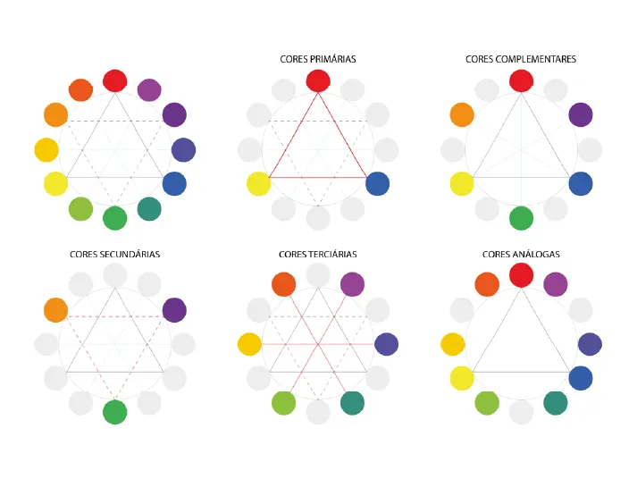
Colors can be divided into two main groups: warm and cool colors. Warm colors include reds, oranges, and yellows, which tend to stand out and attract attention. On the other hand, cool colors encompass greens, blues, and purples, which recede into the background and draw less attention.
It’s advisable to avoid mixing colors from these groups as they can create unpleasant contrasts. For instance, red text on a blue background or green text against an orange background can strain the eyes and make reading difficult.
Creating a color palette using colors from the same group is beneficial when designing presentation slides. For example, a combination of blue, purple, and gray blends harmoniously without competing for attention.
While warm and cool colors generally have distinct effects, they may vary depending on quantity and contrast. For instance, small black shapes on a white background may appear more noticeable due to the contrast, emphasizing the importance of considering these factors when combining colors on slides.
Neutral colors like white, black, and beige complement warm and cool colors and serve as versatile options for backgrounds or accents. However, caution should be exercised when crossing the warm/cool boundary, as mixing colors across these groups can lead to visual discomfort, especially for individuals with color blindness.
Utilizing PowerPoint themes can simplify color combinations, as theme colors are curated to complement each other and perform well in various presentation environments. By understanding color groups and their effects, presenters can create visually appealing slides that effectively convey their message while avoiding visual distractions and discomfort for the audience.
Color Schemes

A color scheme in presentations is a collection of colors that work well together, creating a pleasing and unified appearance. You can easily find suitable color palettes using online tools, or you can start with your logo or brand colors and build from there.
Professional presentations often use specific color combinations, such as gray and yellow or blue and white. These combos are seen as professional because they balance sophistication with energy and optimism or trustworthiness with clarity and authority, making them perfect for business settings.
Consider your presentation screen when choosing colors. Darker schemes suit close-up screens, while lighter ones are better for projections to ensure readability. Avoid bright colors, especially red text on projectors, as they wash out easily.
When choosing colors, think about your audience and setting. Neutral colors like blue, gray, and white are great for professional presentations, while brighter ones like yellow or green might work better for creative or educational topics. Always prioritize readability and avoid jarring color combinations.
Stick to your chosen color scheme throughout the presentation for consistency. Limit yourself to three or four colors to maintain cohesion and avoid distractions. Ensure enough contrast between text/graphics and the background for clarity.
The Color Wheel

The color wheel is a potent tool for understanding color relationships and categories. It features three primary colors (red, yellow, and blue) , three secondary colors (orange, green, and purple) , and six tertiary colors (like red-orange or yellow-green) . This wheel helps in creating diverse color schemes for presentations.
Isaac Newton, at the age of 23, invented the color wheel. He realized how colors, perceived by humans, blend to form captivating combinations. His categorization included:
1. Primary Colors : Red, yellow, blue 2. Secondary Colors : Orange, green, violet (formed by mixing primary colors) 3. Tertiary Colors : Colors like red-orange or blue-violet (resulting from mixing primary and secondary colors)
Understanding the color wheel involves recognizing warm colors (reds, oranges, yellows) and cool colors (blues, greens, violets). Warm colors evoke feelings of energy and brightness, while cool colors suggest calmness and serenity.
Three fundamental color combinations are essential:
1. Complementary Color Combinations : Colors opposite each other on the wheel create high contrast and catch attention. 2. Analogous Color Combinations : Colors adjacent on the wheel, offering balance with one color dominating the foreground and the other as the background. 3. Triadic Color Combinations : These vibrant and harmonious colors evenly spaced on the wheel form a dynamic contrast. Creating a triangle on the wheel reveals these three colors.
Selecting the Perfect Palette: Best Color Choices for Your Presentation
Choosing the right colors for your presentation is more than just making it visually appealing. It’s about conveying your message effectively and creating a lasting impression on your audience. From branding alignment to readability and psychological impact, here are seven essential considerations when selecting colors for your next presentation.
1. Branding : Ensure your color choices align with your brand identity to reinforce recognition and trust.
2. Readability and Contrast : Prioritize high contrast for readability and accessibility across different devices and screens.
3. The 60-30-10 Rule : Harmonize colors using this simple guide for balanced color proportions.
4. Color Psychology : Understand how colors influence emotions and perceptions to evoke the desired response from your audience.
5. Color Groups : Differentiate between warm and cool colors and use them strategically to create harmony and avoid visual discomfort.
6. Color Schemes : Explore various color combinations, considering your audience and setting, to maintain consistency and enhance readability.
7. The Color Wheel : Use this powerful tool to grasp color relationships and categories, guiding your selection process for cohesive and engaging presentations.
By mastering these fundamental principles, you can craft presentations that mesmerize your audience and convey your message.
Frequently Asked Questions (FAQs)
1. How do colors impact presentations? Colors play a significant role in presentations, influencing the audience’s emotions and understanding. They can evoke various feelings and associations; for instance, red can convey urgency, while blue instills calmness and trust.
2. Why is choosing the right color important? Selecting suitable colors is crucial as they reflect professionalism and enhance message clarity. Different presentations require different color tones; for example, vibrant hues may energize new clients, while stable shades reassure long-term investors.
3. How can I ensure my presentation looks professional? Maintaining professionalism in presentations is vital for a positive image. Matching color schemes to your brand’s identity fosters consistency and credibility, reflecting your expertise.
4. What role does readability play in color selection? Readability is essential for effective communication. Optimal contrast between text and background aids clarity, ensuring your message is easily understood. Consistency in color usage enhances readability and professionalism throughout the presentation.
Enhance Your Presentation with Perfect Colors
Are you struggling to find the right colors for your presentations? Let Prezentium , the AI-powered business presentation service provider, be your guide. With our expertise in visual design and data science, we offer three specialized services tailored to your needs:
1. Overnight Presentations : Send us your requirements by 5:30 pm PST, and wake up to a stellar presentation delivered to your inbox by 9:30 am PST the next business day.
2. Prezentation Specialist : Our team of experts transforms your ideas and meeting minutes into captivating presentations. We also assist in creating new designs and templates.
3. Zenith Learning : Join our interactive communication workshops and training programs, combining structured problem-solving with visual storytelling for maximum impact.
Harness the power of color psychology and strategic color selection to elevate your presentations. Whether you need to align with your brand, prioritize readability and contrast, or master the 60-30-10 rule, Prezentium has you covered.
Don’t miss the opportunity to captivate your audience and leave a lasting impression. Contact Prezentium today and take your presentations to the next level!
Why wait? Avail a complimentary 1-on-1 session with our presentation expert. See how other enterprise leaders are creating impactful presentations with us.
Communication Research: Supportive Communication Skill Attributes
Effective stakeholder communication plan: benefits and examples, cross-cultural communication: cross cultural communication tips.
What are the Best Colours for Your PowerPoint presentation?
- By Illiya Vjestica
- - January 26, 2023
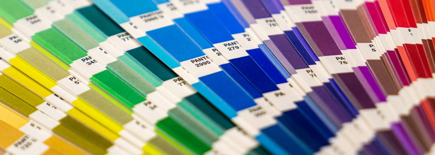
Choosing the best colours for PowerPoint isn’t as black and white as it seems. Many factors go into picking a powerful palette – involving everything from your audience’s emotions to your talk’s cultural context and, of course, to how your slides look.
Suppose you’re taking it as seriously as you should. In that case, you need to consider all of these when deciding on your colour scheme – as nailing this aspect of your presentation’s design will help you to communicate your message in the most impactful way possible. Interested? Let’s get stuck in.
Complementary colours
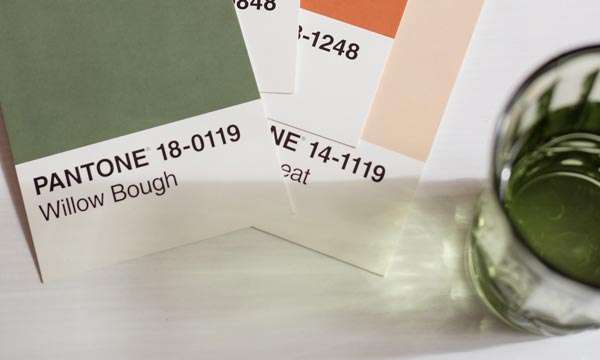
It would help to consider contrast when picking two or more colours for your presentation.
Contrasting colours are valuables when it comes to heightening the visual effect of your slides. They’re instantly impactful – reeling your viewers in by drawing their eyes to the screen. Also, they enhance your slides’ other elements – such as any fonts or tables used – increasing their visibility when used correctly. There’s a reason why black is nearly always paired with white and blue with yellow or orange. Together, they create a powerful impression… and it’s all thanks to contrast.
There’s a simple way to discover contrasting colours, and that’s by using a simple colour wheel. With this tool, you can easily see which colours are the opposite of which… helping you to refine your palette and ensure your presentation has colourful clout.
It also helps to follow the 60-30-10 colour rule . It’s generally for interior decorating but can support picking a colour scheme.
What Colours should not be used in PowerPoint?
When choosing colours for your slides, it’s important to create a contrast between the background and the text. I recommend avoiding using light text on a light background.
For example, a yellow background with white text often makes the text difficult to read. Likewise, with yellow text on a white background, it’s challenging to see.
Make sure your presentation content can be seen at the back of the room. You can use a colour contrast checker to ensure you have a strong contrast ratio to ensure your slides will be readable. This will help make your text more readable and provide a clear contrast between the text and background of your slides to enable your audience to follow along easily.
What are the Most Popular Colours for PowerPoint?
Here are some of the best colour combinations in PowerPoint. You can choose to experiment with your own as well.
Red & Black

Black & Yellow

Others include:
Blue & Yellow
Black & White
Orange and blue
Yellow and purple
Black and white
The selection method is slightly different for more complex presentations using three or more contrasting colours (triadic colours, for those who want to know). Pick three equally distanced colours around the colour wheel to choose the best complementary shades. These colours should, again, work beautifully together – providing that perfect contrast you crave.
Popular triadic choices include:
- Orange, green and purple
- Yellow, blue and red
Generally, we wouldn’t advise throwing a fourth colour into the mix – or more, besides. While using bright colours can have a wonderfully eye-catching effect on your PowerPoint slides, using too many at once could make them too “busy” – overloading the audience and detracting from the potential power of the colour combinations you’ve used. Adhere to the cliche “less is more”, and your simple yet striking presentation should speak for itself.
Colour psychology

You’re probably already familiar with the basic principles of colour psychology. Essentially, it’s been said that specific colours have set effects on people – specifically, causing them to feel a particular way. For instance, red is purported to inspire anger, blue to calm, and yellow to feel joy.
While there’s something to be said for this, colour psychology (as many people understand it) isn’t a flawless theory for one big reason: emotions aren’t quantifiable! Therefore, we can’t honestly claim that specific colours create the same feelings in every person – everybody’s different, and shades carry unique meanings for most of us.
You want to tap into your audience’s context of specific colours and other psychological and physical factors that may come into play. This is where the true magic of colour psychology lies. By understanding what influences your audience when it comes to colour – and knowing which colours are paired up with which emotions and responses in their lives – you can design something that sings. For instance, did you know that while, in Western and Japanese culture, the concept of love is associated with the colour red, it’s symbolised by the colour blue in African culture and yellow in Native American?
You can also your colour choice to the theme of your presentation. More on that later.
Know your audience. Get to know what inspires them, and let that influence your palette. It could make all the difference.
Colour symbolism

So, now you know to look into contrasting colours and your audience’s association with them. But we’re missing one major factor: you. What colours reflect you the best?
There are two ways that you can approach figuring this out. The first is straightforward: looking at your brand’s existing design. If you have a strong image already – of which colours will doubtlessly play a role, used on your website, logo and elsewhere – this is where you should start when designing your presentation. After all, these colours are already associated with you, so using them will create a strong link between your PowerPoint and the rest of your materials. Further, use colours so your audience can recognise you more quickly, and your presentation should look more professional. There are a lot of pros.
Option two requires a bit of decision-making. Suppose your brand doesn’t have any firm affiliations to colour already. In that case, you should consider which colours are associated with what in the context of your presentation and overarching brand ethos. Similarly to the colour psychology we’ve discussed, these hues will help you communicate your message clearly (and colourful). Some colour combinations are considered classic. They go together
Some popular colour associations include:
- Green – nature, the environment
- Blue – the ocean, sadness (referred to as “the blues”!)
- Orange – warmth, autumn
- Red – anger, love, energy
So: what are you talking about? Are there any clear colour associations to that topic already? Drill down to the heart of your presentation’s message, and choose the colours that reflect that the most.
One final thing. Once you’ve discovered your “essential” colour – whether that’s the colour that’s most strongly associated with the topic of your presentation or the colour that you’re hoping will have the biggest influence on your audience – make sure to make it the strongest colour on your palette (for instance, the background of your slides). This should ensure it delivers the impact you’re hoping for… levelling up your talk. Perfection.
Over to Hue
We know that we’ve given you a lot to think about, but if you’re ever feeling confused over colour, remember that it all boils down to the following factors:
Your brand + your audience’s colour associations + visual effect = the best palette
Once you’ve nailed this equation, the rest should come quickly. Good luck!
Choosing the right colours is one thing – putting together a presentation your audience will never forget. That’s another. Get in touch with us today to see how we can help your slides shine.
Create stunning presentations with our templates, toolkits and guides.
Illiya Vjestica
Share this post:, related posts.

Make Your Slides Intriguing Like Author Sam Horn

7 Surprising Benefits of Using Google Slides
Leave a comment cancel reply.
Your email address will not be published. Required fields are marked *
We use cookies to enhance your experience. By continuing to visit this site, you agree to our use of cookies
How to choose the best colors for your presentation
Learn the best colors for business presentations to evoke emotions, brand your presentation, and highlight data.
Emily Branch
Building presentations

Table of contents
What makes white text on blue pop while neon green text on red makes you cringe? Colors matter, even if they’re not the primary focus of your presentation. The right colors direct your eye, evoke emotions and brand your presentation. But the wrong colors distract your audience and hurt your message.
Want to know the best colors to use in your next presentation?
We’ll walk you through six tips design experts agree on for building presentations that are attractive, easy to read, and visually unique.
Key Takeaways:
- Build your color palette around your brand color
- Some colors evoke specific emotions or encourage an action
- Use complementary colors that contrast rather than conflict
- Stick with three to four colors in your presentation, so you don’t overwhelm the audience
6 tips for choosing the best colors for presentations
Use these tips to help you choose colors that fit your presentation’s message and your brand when creating presentations for your business.
1. Consider your company's branding
Your company’s color palette is the best place to start when choosing colors. Business presentations usually have the logo in a corner, tucked away, so it doesn’t distract from the slides but is still visible for consistent company branding .
The colors you use on the slides should work with the logo and brand colors. Complementing the colors is easier on the eye and connects the message to the company’s branding .
HubSpot’s branding subtly reveals itself in all of the company’s imagery. A recent slide set on social media shows how the company ties in its signature shades of orange without overpowering the presentation. Anyone who sees this presentation and is familiar with the brand knows it’s from HubSpot without seeing a logo.
.webp)
2. Evoke emotions with colors
Colors have meaning and evoke emotional responses. Think about how many news stations incorporate red, representing action or emergencies.
But when looking for a financial institute, you won’t see many using a color associated with danger. Instead, you’ll primarily find greens and blues, which relax customers and help them feel more trusting.
The color you choose for your presentation should match the emotional response you want to achieve.
Here are some emotions associated with common colors according to marketing color psychology:
- Blue: Sincerity, honesty, down-to-earth
- Pink: Creative, imaginative, trendy
- Green: Reliable, intelligent, successful
- Purple: Sophisticated, luxurious, charming
- Yellow: Outdoorsy, rugged, cheerful
Keep in mind that the psychology of color in marketing isn’t consistent. Your audience’s emotional response depends on their cultural upbringing, brand exposure, and personal experience.
For example, if you show green and yellow to three people, one might think of sports and the Green Bay Packers. The second person would think of John Deere and farming. The third person may think of Subway and food.
So, while you can consult color meanings when designing your presentation, you don’t have to fit your color scheme within a box.
3. Highlight actions with colors
Colors can also highlight the actions you want your audience to take. If you’re training staff on dos and don’ts, you might list the do’s next to green dots and don’ts next to red dots because of the color association.
You can also use colors to help specific ideas stand out, like putting each page's call to action in a different text color. Consider highlighting each section’s main point with a different color as well.
4. Combine color groups
Colors fall into two primary groups: warm and cool colors. You want to avoid mixing colors from these groups as they tend to contrast (and not pleasantly). Just imagine staring at red text on a blue page or green text against an orange background.
For combinations that are easy on the eye, create a color palette for your presentation’s design using colors in the same group. A pleasant combination would be blue, purple, and gray. These three colors blend well together without fighting for the eye’s attention.
.webp)
5. Improve the text’s readability
Colors will either make up the foreground or background. Text and images in the foreground are information your audience will see and read. Meanwhile, shapes and background colors fill in the empty space.
When choosing colors, you want to keep the foreground information, especially text, separate from any background colors and images.
Using a light and dark contrast is the best way to help your text stand out. Black text on white, white text on a navy background, and dark green text on a beige background are all light and dark contrasts within a color group that work well with each other.
Contrasts also keep text visible for those who might have color blindness. So, even if they don’t see the individual colors, they can still read the text because it’s a different shade.
What you want to avoid are colors that are hard on the eye. For example, you don’t want to use neon green as a text color as that is challenging to read, even with a dark background.
Neutral colors are best for professional presentations. These help the audience quickly read and digest complex business data.
6. Stick with one color scheme
Once you’ve chosen your color scheme, stick with it throughout your presentation. The background, text, and headline colors should remain consistent throughout all your slides.
Generally, stick with no more than three or four colors in one presentation. This ties the entire presentation together and limits the noise that might distract from your central message.
Find color combinations that work
There are so many color combinations and options—how can you choose which one will work best?
Instead of guessing, work with the Prezent platform to create stunning business presentations in a fraction of the time. Our 35,000+ templates are pre-designed with color combinations that are attractive to the eye and easy to read.
With Prezent’s collaborative media library, you can also upload your company’s logo and colors to receive customized slides that fit your branding style. Switch out the look and feel of your presentation in just a few clicks for 100% brand-compliant slides every time. Ready to learn more?
Sign up for our free trial or book a demo today to see the full potential of your next business presentation.
More blog articles

How to counter quiet quitting with effective communication

How to improve healthcare communication systems

The 5 best books about communication
Get the latest from Prezent community
Join thousands of subscribers who receive our best practices on communication, storytelling, presentation design, and more. New tips weekly. (No spam, we promise!)

IMAGES
VIDEO
COMMENTS
The good news is that all the templates on this list are designed by professionals who understand this and therefore use natural color gradients to create a professional look. 4. Choose the Right Color Scheme for Your Screen Type. Finally, don't forget to consider the screen you plan on showcasing your PowerPoint presentation on. Darker color ...
Red is one of the most influential colors in your software palette — but it also carries negative cultural attachments, so use it carefully. Red is also a great color for conveying passion. Or talking about the competition. Do not use Red in financial information or tables and charts. Examples of RED in Presentations
Last but not least, we have the warm color scheme on our list of the best presentation color schemes! Best suited for cosmetics and fashion sector presentations, this palette uses warm neutral colors, like different light and dark tones of red. Using neutral colors allows your slides to be versatile and can be paired up with almost anything ...
US—S4Rƒ @×=d$´•öð '"Ö ª ™ ¬þøõçŸÿþS`0îþ 0-Ûq¹=^Ÿß Ë´þܹœø¸f Ï€ Z¼ vf_Ü=['ŸBâI¢ €Z Ùqù/M«Þ¦ ë5z4'ó1 ³ŠÂ„JuiVêÖ"jÔÇ?
The 60-30-10 Rule: Harmonize colors using this simple guide for balanced color proportions. 4. Color Psychology: Understand how colors influence emotions and perceptions to evoke the desired response from your audience. 5. Color Groups: Differentiate between warm and cool colors and use them strategically to create harmony and avoid visual ...
After all, these colours are already associated with you, so using them will create a strong link between your PowerPoint and the rest of your materials. Further, use colours so your audience can recognise you more quickly, and your presentation should look more professional. There are a lot of pros. Option two requires a bit of decision-making.
What are the best background and text colors for a PowerPoint presentation? The best colors for slides have high contrast so they are easily seen. Dark backgrounds should have light text and bright accent colors. Light backgrounds should have dark text and bold accent colors. This way the audience can read the text and see the graphs or shapes ...
It's a great way to see the best background color for presentation use instantly. Complimentary color combinations take full advantage of contrast. For a more exact approach, drag the sliders to change up RGB color mode elements. These help you dial in custom tones and gain the ultimate in creative control.
The color scheme in this section is an excellent reminder that only a single hue is enough to create an engaging presentation. The best colors for PowerPoint presentations seek to complement the content, and this is the best example. I like to call this color scheme, "highlighting success." A single bright color like the green shade in this ...
Use these tips to help you choose colors that fit your presentation's message and your brand when creating presentations for your business. 1. Consider your company's branding. Your company's color palette is the best place to start when choosing colors. Business presentations usually have the logo in a corner, tucked away, so it doesn ...