

How to Describe a Graph in Writing [+ 22 Examples]
Graphs are a powerful way to convey data visually, but describing them effectively is crucial.
I’ll guide you through the types of graphs and practical ways to write about them, whether in essays, reports, or presentations. Let’s make data storytelling seamless and comprehensive.
Types of Graphs

Table of Contents
The first thing you need to know are the major types of graphs–and there are several.
Read on to learn the most important points about each one.
Line Graphs

Line graphs are essential for displaying changes over time.
Each data point is plotted and connected by a line, making it perfect for tracking trends or progressions.
For instance, it’s often used in business to show quarterly sales or yearly revenue growth.
The slope of the line reveals trends – a steep rise means rapid growth, while a dip signals a decline.
Multiple lines can be included to compare trends across different categories, products, or demographics.
Always label your axes clearly, with time on the x-axis and the measured variable on the y-axis for straightforward comprehension.

Bar graphs excel in comparing different categories or groups.
Each bar represents a category’s value, offering a visual side-by-side comparison.
Their versatility makes them ideal for financial data, demographic information, or survey responses.
Vertical bars emphasize magnitude differences, while horizontal bars are useful when categories are long or numerous.
Each bar should be uniformly spaced to prevent misleading interpretations.
Use different colors or patterns for various groups to enhance readability and clarify distinctions.
Always start the y-axis at zero to accurately represent data differences and avoid exaggerating trends or disparities.

Pie charts visually convey how individual parts contribute to a whole.
Each slice represents a category’s proportion, making it clear how each segment relates to others. Use them when showing relative percentages, like budget allocations or market shares.
The sum of all slices should always equal 100%, so they are not suitable for continuous data or comparisons across time.
Limit the number of slices to 5-7 for clarity.
Highlight critical slices with distinct colors or labels, and consider combining smaller segments into an “Other” category for better visualization.
Scatter Plots

Scatter plots are crucial when examining relationships between two variables.
Each point represents a pair of data, plotted on the x and y axes.
This method is particularly valuable in scientific research, economics, and marketing, helping to identify trends, correlations, or clusters.
A positive correlation shows that as one variable increases, so does the other, while a negative correlation indicates an inverse relationship.
Clusters suggest groups with shared characteristics.
A trend line can be drawn to illustrate the relationship between variables.
Scatter plots are excellent for identifying outliers that may warrant further investigation.

Histograms look like bar graphs but represent frequency distributions for continuous data.
Data is grouped into bins, where each bar’s height shows the frequency of data points falling within that range.
For instance, histograms can reveal customer age distribution or test scores.
The bins should be of equal size, and the data continuous.
Adjust the number of bins according to data spread: too many create a confusing graph, while too few obscure patterns. Unlike bar graphs, histograms shouldn’t have gaps between bars unless there are no data points in that range.
11 Ways to Describe a Graph in Writing
Now let’s go through 11 ways that I’ve found to clearly and cleverly describe graphs in all your writing.
Describing the graph’s shape provides immediate visual insight into trends and patterns.
A linear trend suggests consistent data, while a curved line indicates shifts in growth rate.
Peaks represent rapid growth periods, whereas valleys highlight declines. Flat sections may signal stabilization.
If describing a bar graph, look for patterns like pyramid shapes or skewed distributions.
Pie charts often have distinct shapes when grouped segments stand out.
Highlighting these forms helps readers understand data dynamics quickly.
- “The line graph’s shape is linear, showing a consistent rise in revenue.”
- “The bar graph forms a pyramid, indicating balanced age distribution.”
Quantify the graph’s data range by focusing on its extremes.
Determine the minimum and maximum values to illustrate fluctuations, whether significant or moderate.
Emphasize the overall range to offer perspective on the extent of the trends.
For instance, large differences between bars or peaks highlight strong growth, while small variations suggest stability.
Providing size context gives your audience a sense of proportion, making the data’s impact more meaningful.
- “The graph’s highest point is $12 million, contrasting sharply with its lowest at $1 million.”
- “Temperature shifts varied by 40°C, from -20°C in winter to 20°C in summer.”
When describing line graphs, analyze the lines for clues about trends.
Is the line smooth or jagged?
A smooth line suggests stable growth, while jagged lines imply sudden changes.
Pay attention to the slope: a steep incline or decline represents rapid shifts, while a shallow slope signals gradual changes.
Highlight sections where lines intersect, converge, or diverge, indicating crucial turning points or contrasts between data sets.
- “The line sharply inclines in Q2, then plateaus in Q3 due to seasonal trends.”
- “The two lines cross each other in September, revealing a pivotal shift.”
Axis Labels
Accurate axis labeling clarifies the data categories and units used.
For line graphs, the x-axis typically denotes time or specific groups, while the y-axis indicates the measured value.
Bar graphs require clear labels to identify the represented categories.
Scatter plots often show correlations, so it’s essential to label both variables accurately.
Incorrect labeling can lead to confusion, so ensure your axes directly correspond to the data presented.
- “On the bar graph, the x-axis shows months, and the y-axis tracks monthly revenue.”
- “The scatter plot’s x-axis measures advertising expenses, while the y-axis records sales.”
Identifying and describing trends helps readers grasp the graph’s narrative.
Is there a general upward or downward trajectory? Are trends consistent, fluctuating, or mixed?
An upward trend signifies growth, while downward trends indicate decline.
If trends fluctuate significantly, highlight potential causes like seasonality or market changes.
Trends can also differ between data sets in the same graph, so compare trends side by side.
- “The graph reveals an upward trend in quarterly revenue, suggesting steady business growth.”
- “Despite fluctuations, the overall trend is downward, indicating reduced consumer interest.”
Comparisons
When comparing multiple data sets in the same graph, focus on similarities and differences.
Highlight which sets lead or lag, noting by how much.
Compare growth rates, peak times, or relative sizes between bars or lines. Emphasize differences that are statistically significant or exceed expectations.
Highlight where data sets converge or diverge, offering insights into critical market trends or strategic opportunities.
- “Product A outsold Product B, particularly in Q2 and Q3.”
- “While Company X’s revenue plateaued, Company Y showed remarkable growth.”
Identifying anomalies brings attention to unexpected data points that break the pattern.
Outliers, significant spikes, or dips can indicate errors, market disruptions, or seasonal effects.
Comparing these to broader trends can help interpret their significance.
Outliers might need verification, especially if they contradict the general pattern. Recognizing anomalies also guides corrective actions or further analysis.
- “A sudden spike in Q1 2023 was due to a successful marketing campaign.”
- “The outlier data point in November appears inconsistent with historical trends.”
Gaps and Inconsistencies
Gaps or inconsistencies highlight where data is incomplete or missing, complicating analysis.
Gaps might result from system errors, data unavailability, or incomplete data sets.
Label these gaps clearly to prevent misinterpretation. Inconsistencies may also arise from misaligned data categories, differing collection periods, or varied data sources.
Understanding and explaining these gaps or inconsistencies is crucial for accurate reporting.
- “Data gaps between Q3 and Q4 make trend analysis challenging.”
- “Sales data for Europe is inconsistent, possibly due to reporting delays.”
Understanding and conveying the unit of measurement is essential for accurate interpretation.
Whether it’s dollars, percentages, or thousands of items, units contextualize data and allow accurate comparisons.
Inconsistent units across multiple graphs can lead to confusion, so ensure they’re uniformly labeled.
For continuous data, specify the increments used along the y-axis.
- “Profits are measured in millions of dollars along the y-axis.”
- “Population size is recorded in thousands, revealing a significant growth trend.”
Colors and Patterns
Effective color and pattern use make graphs more readable.
Use contrasting colors to distinguish between data sets or groups. Patterns can help differentiate data if colors are not an option.
Avoid overusing color, which can cause confusion or distract from key insights.
Ensure that color choices align with industry standards or audience preferences, and label colors/patterns clearly.
- “Blue represents the North region, while green highlights the West.”
- “The dotted line marks international sales, while the solid line shows domestic trends.”
Clarify the graph’s primary purpose – whether it’s to compare, analyze trends, or identify correlations.
Knowing the graph’s goal helps focus on the most relevant insights.
For comparisons, emphasize differences and similarities.
For trends, focus on direction and consistency. Correlation graphs should highlight relationships between variables.
Clearly stating the graph’s purpose enables the audience to understand the intended takeaway.
- “The bar graph compares the revenue of different departments over five years.”
- “The scatter plot correlates customer satisfaction scores with net promoter scores.”
Here is a good video about how to describe a graph:
Paragraph Examples of Describing a Graph
Here are three examples of how to describe a graph in a paragraph.
Line Graph Analysis
The line graph displays quarterly revenue growth from 2019 to 2023. We see a steady increase from Q1 2019 to Q4 2020, followed by a sudden decline due to the pandemic. Revenue rebounded quickly in Q1 2021 and remained on an upward trajectory since, suggesting economic resilience despite setbacks.
Bar Graph Analysis
The bar graph compares monthly sales of three products over a year. Product A consistently outperformed the others, with notable peaks in summer months. Product B showed more stable growth, while Product C had fluctuating sales, possibly due to seasonal demand.
Pie Chart Analysis
The pie chart illustrates the market share of five smartphone brands. Brand X holds the largest share at 40%, followed by Brand Y at 25%. The remaining three brands together capture 35%, highlighting intense competition.
Final Thoughts: How to Describe a Graph in Writing
Describing graphs is crucial for clear data communication.
Remember to identify the graph type, focus on key features, and adapt language for the audience. Let your graph’s story shine.
Read This Next:
- How to Describe Good Work Ethic on a Resume [100+ Examples]
- How to Write an Address (21+ Examples)
- How To Describe Glitching In a Story (17 Pro Tips + Examples)
- How to Describe Melody in Writing
- How to Describe Tone in Writing
Describing charts

Learn how to write about charts.
Do the preparation task first. Then read the text and tips and do the exercises.
Preparation
Grouping_MjMxNjE=

The first chart illustrates the percentage of the population who owned a smartphone from 2011 to 2016, and the second breaks the percentages down by age for 2011 and 2016.
Overall, smartphone ownership increased during the six-year period. In general, the younger people were, the more likely they were to own a smartphone. However, the most significant increases in smartphone ownership between 2011 and 2016 came from people aged 45 to 54, from 46% to 84%; from those in the 55 to 64 category, from 9% to 59%; and from those aged 65 to 74, from 5% to 50%.
The percentage of people who owned a smartphone rose steadily, starting at around 35% in 2011 and reaching about 77% by 2016. People aged 16 to 24 represented the greatest percentage of smartphone ownership in both 2011 and 2016. 75% of people aged 25 to 34 and 72% of those aged 35 to 44 owned a smartphone in 2011, rising to 88% and 86% respectively by 2016.
Although almost nobody in the 75+ age category owned a smartphone in 2011, 15% of this group owned smartphones in 2016.
Please note: This page was designed for writing practice only. Information and statistics in the charts may not be accurate.
- If you are doing an exam task, read the instructions and make sure you write according to the word and time limits.
- Start by saying what the charts show. In an exam, change the words in the question to write the first sentence of your answer, e.g. These charts show = These charts illustrate .
- The second paragraph should provide an overview of the key features of the information.
- The other paragraphs should describe the patterns or trends in more detail. However, only select the most important ones to write about, and don't write about your own ideas.
- Use linking words and a range of vocabulary to describe what you see in the charts. (You can write % or per cent, but be consistent.)
- Be careful to use the correct tenses to describe the time periods shown.
Do you ever have to write about charts at work or for your studies?
Language level
Yes, I did. In my work I often show charts of workplace accidents and show how they are reducing over the years but not fast enough
- Log in or register to post comments
I think I never writed about chart,but I use this,because it is very convenient.
Analyzing, understanding, explaining and drawing conclusions from different types of graphs and data in general is actually a main part of my duties and probably the one I like the most. It is very challenging to search for useful information or new insights hidden in complicated patterns about people, behaviors or financial results.
actually, I have never written about charts at work or for my studies,so I think it is very difficult .I wish I can but I dont understand the charts to describe it ..please do me afavour and teach me how to write about chart .because I want to get an IELETS test .
Hello Zaman_A,
I'd recommend that you work with the text on this page. First of all, read through it a few times. Notice the vocabulary used to talk about numbers and changes in numbers, e.g. 'percentage', 'from 2011 to 2016', 'break down percentages', 'increased during a period', etc. Make sure you understand the vocabulary and write them down somewhere.
Then you could try to write a sentence or two to describe what you see in the chart. Compare what you said to the model text and learn from any mistakes you made. If you want feedback on a specific sentence, feel free to write it in a comment here and ask us for feedback on it. We don't provide feedback on long texts, but we can answer questions about a sentence or phrase.
When I was learning Spanish, I used to copy short texts several times to try to learn the vocabulary and grammar. That doesn't work well for every one, but it does for me and some other people. You could try it and see how it goes for you.
There are also several other pages in the Writing and Reading skills sections -- be sure to check other levels, too -- that involve describing charts. Use the same approach with a few of those pages and I think that should help you improve quite a lot.
Good luck and let us know how you get on!
All the best, Kirk LearnEnglish team
Yes, I have in my shcool I had a subject called stadistich or something like that, we analyzed different events that has happened in the life in general.
This is an absolutely example of a misleading chart since the total number of perentage each age range over 100%. Being said that, the inaccurate of the data due to writing pratice purpose is allowed as per the note, chart should be chosen logically.
Hello Thu_tran2911,
I assume you're referring to the two bar charts rather than the line chart. I don't agree that these are misleading. The bars do not show a percentage of the total population but rather what percentage of each age group owns smartphones. In other words, in 2011 over 80% of people aged 16-24 owned smartphones and just under 80% of people aged 25-34. There is no reason to add these together; they describe different groups, not percentages of the whole population.
In a similar way, I could say that 60% of women have brown eyes in a certain country while 70% of men have brown eyes. That does not mean that we are describing 130% as each statistic describes the percentage within a group and not within the country as a whole.
The LearnEnglish Team
actually, I have never written about charts at work or for my studies but I will do it in the future.
Yes, I'm a economics students so I frequently used charts and tables to illustrate trends. I have many charts present in front of my teacher.
Online courses

Group and one-to-one classes with expert teachers.

Learn English in your own time, at your own pace.

One-to-one sessions focused on a personal plan.

Get the score you need with private and group classes.

Figures and Charts
What this handout is about.
This handout will describe how to use figures and tables to present complicated information in a way that is accessible and understandable to your reader.
Do I need a figure/table?
When planning your writing, it is important to consider the best way to communicate information to your audience, especially if you plan to use data in the form of numbers, words, or images that will help you construct and support your argument. Generally speaking, data summaries may take the form of text, tables or figures. Most writers are familiar with textual data summaries and this is often the best way to communicate simple results. A good rule of thumb is to see if you can present your results clearly in a sentence or two. If so, a table or figure is probably unnecessary. If your data are too numerous or complicated to be described adequately in this amount of space, figures and tables can be effective ways of conveying lots of information without cluttering up your text. Additionally, they serve as quick references for your reader and can reveal trends, patterns, or relationships that might otherwise be difficult to grasp.
So what’s the difference between a table and a figure anyway?
Tables present lists of numbers or text in columns and can be used to synthesize existing literature, to explain variables, or to present the wording of survey questions. They are also used to make a paper or article more readable by removing numeric or listed data from the text. Tables are typically used to present raw data, not when you want to show a relationship between variables.
Figures are visual presentations of results. They come in the form of graphs, charts, drawings, photos, or maps. Figures provide visual impact and can effectively communicate your primary finding. Traditionally, they are used to display trends and patterns of relationship, but they can also be used to communicate processes or display complicated data simply. Figures should not duplicate the same information found in tables and vice versa.
Using tables
Tables are easily constructed using your word processor’s table function or a spread sheet program such as Excel. Elements of a table include the Legend or Title, Column Titles, and the Table Body (quantitative or qualitative data). They may also include subheadings and footnotes. Remember that it is just as important to think about the organization of tables as it is to think about the organization of paragraphs. A well-organized table allows readers to grasp the meaning of the data presented with ease, while a disorganized one will leave the reader confused about the data itself, or the significance of the data.
Title: Tables are headed by a number followed by a clear, descriptive title or caption. Conventions regarding title length and content vary by discipline. In the hard sciences, a lengthy explanation of table contents may be acceptable. In other disciplines, titles should be descriptive but short, and any explanation or interpretation of data should take place in the text. Be sure to look up examples from published papers within your discipline that you can use as a model. It may also help to think of the title as the “topic sentence” of the table—it tells the reader what the table is about and how it’s organized. Tables are read from the top down, so titles go above the body of the table and are left-justified.
Column titles: The goal of column headings is to simplify and clarify the table, allowing the reader to understand the components of the table quickly. Therefore, column titles should be brief and descriptive and should include units of analysis.
Table body: This is where your data are located, whether they are numerical or textual. Again, organize your table in a way that helps the reader understand the significance of the data. Be sure to think about what you want your readers to compare, and put that information in the column (up and down) rather than in the row (across). In other words, construct your table so that like elements read down, not across. When using numerical data with decimals, make sure that the decimal points line up. Whole numbers should line up on the right.
Other table elements
Tables should be labeled with a number preceding the table title; tables and figures are labeled independently of one another. Tables should also have lines demarcating different parts of the table (title, column headers, data, and footnotes if present). Gridlines or boxes should not be included in printed versions. Tables may or may not include other elements, such as subheadings or footnotes.
Quick reference for tables
Tables should be:
- Centered on the page.
- Numbered in the order they appear in the text.
- Referenced in the order they appear in the text.
- Labeled with the table number and descriptive title above the table.
- Labeled with column and/or row labels that describe the data, including units of measurement.
- Set apart from the text itself; text does not flow around the table.
Table 1. Physical characteristics of the Doctor in the new series of Doctor Who
Table 2. Physical characteristics of the Doctor in the new series of Doctor Who
Using figures
Figures can take many forms. They may be graphs, diagrams, photos, drawings, or maps. Think deliberately about your purpose and use common sense to choose the most effective figure for communicating the main point. If you want your reader to understand spatial relationships, a map or photograph may be the best choice. If you want to illustrate proportions, experiment with a pie chart or bar graph. If you want to illustrate the relationship between two variables, try a line graph or a scatterplot (more on various types of graphs below). Although there are many types of figures, like tables, they share some typical features: captions, the image itself, and any necessary contextual information (which will vary depending on the type of figure you use).
Figure captions
Figures should be labeled with a number followed by a descriptive caption or title. Captions should be concise but comprehensive. They should describe the data shown, draw attention to important features contained within the figure, and may sometimes also include interpretations of the data. Figures are typically read from the bottom up, so captions go below the figure and are left-justified.
The most important consideration for figures is simplicity. Choose images the viewer can grasp and interpret clearly and quickly. Consider size, resolution, color, and prominence of important features. Figures should be large enough and of sufficient resolution for the viewer to make out details without straining their eyes. Also consider the format your paper will ultimately take. Journals typically publish figures in black and white, so any information coded by color will be lost to the reader. On the other hand, color might be a good choice for papers published to the web or for PowerPoint presentations. In any case, use figure elements like color, line, and pattern for effect, not for flash.
Additional information
Figures should be labeled with a number preceding the table title; tables and figures are numbered independently of one another. Also be sure to include any additional contextual information your viewer needs to understand the figure. For graphs, this may include labels, a legend explaining symbols, and vertical or horizontal tick marks. For maps, you’ll need to include a scale and north arrow. If you’re unsure about contextual information, check out several types of figures that are commonly used in your discipline.
Quick reference for figures
Figures should be:
- Labeled (under the figure) with the figure number and appropriate descriptive title (“Figure” can be spelled out [“Figure 1.”] or abbreviated [“Fig. 1.”] as long as you are consistent).
- Referenced in the order they appear in the text (i.e. Figure 1 is referenced in the text before Figure 2 and so forth).
- Set apart from the text; text should not flow around figures.
Every graph is a figure but not every figure is a graph. Graphs are a particular set of figures that display quantitative relationships between variables. Some of the most common graphs include bar charts, frequency histograms, pie charts, scatter plots, and line graphs, each of which displays trends or relationships within and among datasets in a different way. You’ll need to carefully choose the best graph for your data and the relationship that you want to show. More details about some common graph types are provided below. Some good advice regarding the construction of graphs is to keep it simple. Remember that the main objective of your graph is communication. If your viewer is unable to visually decode your graph, then you have failed to communicate the information contained within it.
Pie charts are used to show relative proportions, specifically the relationship of a number of parts to the whole. Use pie charts only when the parts of the pie are mutually exclusive categories and the sum of parts adds up to a meaningful whole (100% of something). Pie charts are good at showing “big picture” relationships (i.e. some categories make up “a lot” or “a little” of the whole thing). However, if you want your reader to discern fine distinctions within your data, the pie chart is not for you. Humans are not very good at making comparisons based on angles. We are much better at comparing length, so try a bar chart as an alternative way to show relative proportions. Additionally, pie charts with lots of little slices or slices of very different sizes are difficult to read, so limit yours to 5-7 categories.
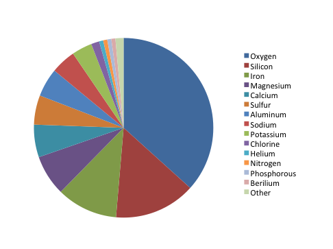
The chart shows the relative proportion of fifteen elements in Martian soil, listed in order from “most” to “least”: oxygen, silicon, iron, magnesium, calcium, sulfur, aluminum, sodium, potassium, chlorine, helium, nitrogen, phosphorus, beryllium, and other. Oxygen makes up about ⅓ of the composition, while silicon and iron together make up about ¼. The remaining slices make up smaller proportions, but the percentages aren’t listed in the key and are difficult to estimate. It is also hard to distinguish fifteen colors when comparing the pie chart to the color coded key.
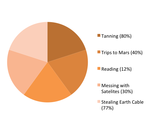
The chart shows the relative proportion of five leisure activities of Venusian teenagers (tanning, trips to Mars, reading, messing with satellites, and stealing Earth cable). Although each of the five slices are about the same size (roughly 20% of the total), the percentage of Venusian teenagers engaging in each activity varies widely (tanning: 80%, trips to Mars: 40%, reading: 12%, messing with satellites: 30%, stealing Earth cable: 77%). Therefore, there is a mismatch between the labels and the actual proportion represented by each activity (in other words, if reading represents 12% of the total, its slice should take up 12% of the pie chart area), which makes the representation inaccurate. In addition, the labels for the five slices add up to 239% (rather than 100%), which makes it impossible to accurately represent this dataset using a pie chart.
Bar graphs are also used to display proportions. In particular, they are useful for showing the relationship between independent and dependent variables, where the independent variables are discrete (often nominal) categories. Some examples are occupation, gender, and species. Bar graphs can be vertical or horizontal. In a vertical bar graph the independent variable is shown on the x axis (left to right) and the dependent variable on the y axis (up and down). In a horizontal one, the dependent variable will be shown on the horizontal (x) axis, the independent on the vertical (y) axis. The scale and origin of the graph should be meaningful. If the dependent (numeric) variable has a natural zero point, it is commonly used as a point of origin for the bar chart. However, zero is not always the best choice. You should experiment with both origin and scale to best show the relevant trends in your data without misleading the viewer in terms of the strength or extent of those trends.
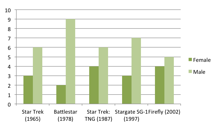
The graph shows the number of male and female spaceship crew members for five different popular television series: Star Trek (1965), Battlestar (1978), Star Trek: TNG (1987), Stargate SG-1 (1997), and Firefly (2002). Because the television series are arranged chronologically on the x-axis, the graph can also be used to look for trends in these numbers over time.
Although the number of crew members for each show is similar (ranging from 9 to 11), the proportion of female and male crew members varies. Star Trek has half as many female crew members as male crew members (3 and 6, respectively), Battlestar has fewer than one-fourth as many female crew members as male crew members (2 and 9, respectively), Star Trek: TNG has four female crew members and six male crew members, Stargate SG-1 has less than one-half as many female crew members as male crew members (3 and 7, respectively), and Firefly has four female and five male crew members.
Frequency histograms/distributions
Frequency histograms are a special type of bar graph that show the relationship between independent and dependent variables, where the independent variable is continuous, rather than discrete. This means that each bar represents a range of values, rather than a single observation. The dependent variables in a histogram are always numeric, but may be absolute (counts) or relative (percentages). Frequency histograms are good for describing populations—examples include the distribution of exam scores for students in a class or the age distribution of the people living in Chapel Hill. You can experiment with bar ranges (also known as “bins”) to achieve the best level of detail, but each range or bin should be of uniform width and clearly labeled.
XY scatter plots
Scatter plots are another way to illustrate the relationship between two variables. In this case, data are displayed as points in an x,y coordinate system, where each point represents one observation along two axes of variation. Often, scatter plots are used to illustrate correlation between two variables—as one variable increases, the other increases (positive correlation) or decreases (negative correlation). However, correlation does not necessarily imply that changes in one variable cause changes in the other. For instance, a third, unplotted variable may be causing both. In other words, scatter plots can be used to graph one independent and one dependent variable, or they can be used to plot two independent variables. In cases where one variable is dependent on another (for example, height depends partly on age), plot the independent variable on the horizontal (x) axis, and the dependent variable on the vertical (y) axis. In addition to correlation (a linear relationship), scatter plots can be used to plot non-linear relationships between variables.
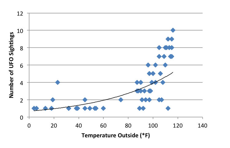
The scatter plot shows the relationship between temperature (x-axis, independent variable) and the number of UFO sightings (y-axis, dependent variable) for 53 separate data points. The temperature ranges from about 0°F and 120°F, and the number of UFO sightings ranges from 1 to 10. The plot shows a low number of UFO sightings (ranging from 1 to 4) at temperatures below 80°F and a much wider range of the number of sightings (from 1 to 10) at temperatures above 80°F. It appears that the number of sightings tends to increase as temperature increases, though there are many cases where only a few sightings occur at high temperatures.
XY line graphs
Line graphs are similar to scatter plots in that they display data along two axes of variation. Line graphs, however, plot a series of related values that depict a change in one variable as a function of another, for example, world population (dependent) over time (independent). Individual data points are joined by a line, drawing the viewer’s attention to local change between adjacent points, as well as to larger trends in the data. Line graphs are similar to bar graphs, but are better at showing the rate of change between two points. Line graphs can also be used to compare multiple dependent variables by plotting multiple lines on the same graph.
Example of an XY line graph:
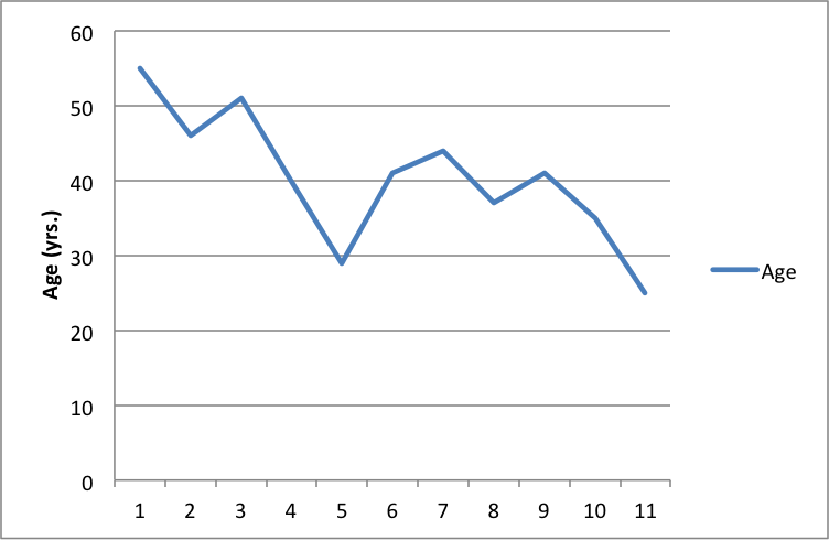
The line graph shows the age (in years) of the actor of each Doctor Who regeneration for the first through the eleventh regeneration. The ages range from a maximum of about 55 in the first regeneration to a minimum of about 25 in the eleventh regeneration. There is a downward trend in the age of the actors over the course of the eleven regenerations.
General tips for graphs
Strive for simplicity. Your data will be complex. Don’t be tempted to convey the complexity of your data in graphical form. Your job (and the job of your graph) is to communicate the most important thing about the data. Think of graphs like you think of paragraphs—if you have several important things to say about your data, make several graphs, each of which highlights one important point you want to make.
Strive for clarity. Make sure that your data are portrayed in a way that is visually clear. Make sure that you have explained the elements of the graph clearly. Consider your audience. Will your reader be familiar with the type of figure you are using (such as a boxplot)? If not, or if you’re not sure, you may need to explain boxplot conventions in the text. Avoid “chartjunk.” Superfluous elements just make graphs visually confusing. Your reader does not want to spend 15 minutes figuring out the point of your graph.
Strive for accuracy. Carefully check your graph for errors. Even a simple graphical error can change the meaning and interpretation of the data. Use graphs responsibly. Don’t manipulate the data so that it looks like it’s saying something it’s not—savvy viewers will see through this ruse, and you will come off as incompetent at best and dishonest at worst.
How should tables and figures interact with text?
Placement of figures and tables within the text is discipline-specific. In manuscripts (such as lab reports and drafts) it is conventional to put tables and figures on separate pages from the text, as near as possible to the place where you first refer to it. You can also put all the figures and tables at the end of the paper to avoid breaking up the text. Figures and tables may also be embedded in the text, as long as the text itself isn’t broken up into small chunks. Complex raw data is conventionally presented in an appendix. Be sure to check on conventions for the placement of figures and tables in your discipline.
You can use text to guide the reader in interpreting the information included in a figure, table, or graph—tell the reader what the figure or table conveys and why it was important to include it.
When referring to tables and graphs from within the text, you can use:
- Clauses beginning with “as”: “As shown in Table 1, …”
- Passive voice: “Results are shown in Table 1.”
- Active voice (if appropriate for your discipline): “Table 1 shows that …”
- Parentheses: “Each sample tested positive for three nutrients (Table 1).”
Works consulted
We consulted these works while writing this handout. This is not a comprehensive list of resources on the handout’s topic, and we encourage you to do your own research to find additional publications. Please do not use this list as a model for the format of your own reference list, as it may not match the citation style you are using. For guidance on formatting citations, please see the UNC Libraries citation tutorial . We revise these tips periodically and welcome feedback.
American Psychological Association. 2010. Publication Manual of the American Psychological Association . 6th ed. Washington, DC: American Psychological Association.
Bates College. 2012. “ Almost everything you wanted to know about making tables and figures.” How to Write a Paper in Scientific Journal Style and Format , January 11, 2012. http://abacus.bates.edu/~ganderso/biology/resources/writing/HTWtablefigs.html.
Cleveland, William S. 1994. The Elements of Graphing Data , 2nd ed. Summit, NJ: Hobart Press..
Council of Science Editors. 2014. Scientific Style and Format: The CSE Manual for Authors, Editors, and Publishers , 8th ed. Chicago & London: University of Chicago Press.
University of Chicago Press. 2017. The Chicago Manual of Style , 17th ed. Chicago & London: University of Chicago Press.
You may reproduce it for non-commercial use if you use the entire handout and attribute the source: The Writing Center, University of North Carolina at Chapel Hill
Make a Gift
- Memberships
- Institutional Members
- Teacher Members

Presentations / Describing Graphs
Describing Graphs
18 more different graphs / charts / tables with paid version.
Other topics: life satisfaction / divorce / religion / mental health / alcohol / mobile phones / murder / technology / leisure / population growth / life expectancy / etc..
Other graphical data lessons
Describing results (questionnaire data) [new 2023].
This lesson teaches students how to describe the results from a questionnaire. It provides language for describing quantities, group sizes, specific features and reporting verbs. It includes model answers and a range of practice activities. Example Level: ** *** [B1/B2/C1] TEACHER MEMBERSHIP / INSTITUTIONAL MEMBERSHIP
Academic description, analysis & evaluation
This lesson helps to improve students’ awareness and understanding of the difference between description, analysis and evaluation. It includes paragraph analysis, a detailed language review reference sheet and graph and sentence level quotation analysis. – see worksheet example. Time: 120mins. Level *** ** [ [B2/C1] TEACHER MEMBERSHIP / INSTITUTIONAL MEMBERSHIP
Memberships (Teacher / Institutional)
Full access to everything - £100 / £200 / £550
Join today * x
- IELTS Scores
- Life Skills Test
- Find a Test Centre
- Alternatives to IELTS
- All Lessons
- General Training
- IELTS Tests
- Academic Word List
- Topic Vocabulary
- Collocation
- Phrasal Verbs
- Writing eBooks
- Reading eBook
- All eBooks & Courses
- Task 1 Lessons & Tips
- Describing a Graph
How to Describe an IELTS Academic Writing Task 1 Graph
On the following pages there are lessons to teach you how to write an academic IELTS writing task 1 but in this first lesson you’ll get an overview of how to answer a task 1.
You can also view a video of this lesson:

Once you have studied the general structure, you can view other examples by looking at the model graphs that are on this site.
Alternatively, follow on with these lessons to a variety of strategies and tips to achieve the writing score you need.
Steps to Respond to a Task 1
To analyse this, we’ll look at a line graph. Look at the following question and the graph.
You should spend about 20 minutes on this task.
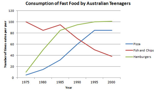
The line graph below shows changes in the amount and type of fast food consumed by Australian teenagers from 1975 to 2000.
Summarize the information by selecting and reporting the main features and make comparisons where relevant.
Write at least 150 words.
There are three basic things you need to structure an IELTS writing task 1.
- Introduce the graph
- Give an overview
- Give the detail
We’ll look at each of these in turn.
Introduce the Graph
You need to begin with one or two sentences that state what the IELTS writing task 1 shows. To do this, paraphrase the title of the graph, making sure you put in a time frame if there is one.
Here is an example for the above line graph:
The line graph compares the fast food consumption of teenagers in Australia between 1975 and 2000, a period of 25 years.
You can see this says the same thing as the title, but in a different way.
Give an Overview
You also need to state what the main trend or trends in the graph are. Don’t give detail such as data here – you are just looking for something that describes what is happening overall.
One thing that stands out in this graph is that one type of fast food fell over the period, whilst the other two increased, so this would be a good overview.
Here is an example:
Overall, the consumption of fish and chips declined over the period, whereas the amount of pizza and hamburgers that were eaten increased.
This covers the main changes that took place over the whole period.
You may sometimes see this overview as a conclusion. It does not matter if you put it in the conclusion or the introduction when you do an IELTS writing task 1, but you should provide an overview in one of these places.
Give the Detail
You can now give more specific detail in the body paragraphs.
When you give the detail in your body paragraphs in your IELTS writing task 1, you must make reference to the data.
The key to organizing your body paragraphs for an IELTS writing task 1 is to group data together where there are patterns . To do this you need to identify any similarities and differences .
Look at the graph – what things are similar and what things are different? As we have already identified in the overview, the consumption of fish and chips declined over the period, whereas the amount of pizza and hamburgers that were eaten increased.
So it is clear that pizza and hamburgers were following a similar pattern, but fish and chips were different. On this basis, you can use these as your ‘groups’, and focus one paragraph on fish and chip and the other one on pizza and hamburgers.
Here is an example of the first paragraph:
In 1975, the most popular fast food with Australian teenagers was fish and chips, being eaten 100 times a year. This was far higher than Pizza and hamburgers, which were consumed approximately 5 times a year. However, apart from a brief rise again from 1980 to 1985, the consumption of fish and chips gradually declined over the 25 year timescale to finish at just under 40.
As you can see, the focus is on fish and chips. This does not mean you should not mention the other two foods, as you should still make comparisons of the data as the questions asks.
The second body then focuses on the other foods:
In sharp contrast to this, teenagers ate the other two fast foods at much higher levels. Pizza consumption increased gradually until it overtook the consumption of fish and chips in 1990. It then levelled off from 1995 to 2000. The biggest rise was seen in hamburgers as the occasions they were eaten increased sharply throughout the 1970’s and 1980’s, exceeding that of fish and chips in 1985. It finished at the same level that fish and chips began, with consumption at 100 times a year.
Full Model Answer:

The line graph compares the fast food consumption of teenagers in Australia between 1975 and 2000, a period of 25 years. Overall, the consumption of fish and chips declined over the period, whereas the amount of pizza and hamburgers that were eaten increased.
(194 words)
Now you've been through this first introductory lesson, you can go to the next lesson or start viewing some model answers.
More Task 1 Academic Lessons:
IELTS Table: Tips and techniques for a high score.
IELTS Table advice for a high score. Learn how to describe an IELTS table, which is just another way to present data.
Describing an IELTS task 1 graph over time
This lesson shows you how to write an IELTS task 1 graph or chart that is over time.
Describing Graph Trends Using the Language of Change
Describing graph trends: In IELTS you must know how to describe the trends that you see in the graph you are given. This lesson provides practice with some common language used to describe trends.

Writing Tips for a Graph in the Future in IELTS Academic
Graph in the future: Sometimes graphs in IELTS refer to a future time. You must know the language to write about these. In this lesson, learn how to write about an IELTS graph in the future. Getting the tenses right is an important part of the IELTS writing task 1.
Learn Compare and Contrast Language for IELTS Graphs
Compare and Contrast Language: In the academic IELTS task 1, you have to know the right language if you want to get a band 7 or higher. Practice your IELTS language for bar charts in this task 1 writing lesson.
Which Tenses for IELTS are the Most Important?
Candidates often ask which tenses for IELTS are needed in order to do well in the exam. This lesson goes through the grammar tenses and how they apply to the test.
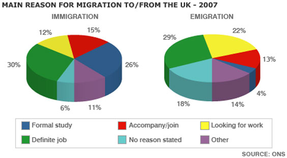
IELTS Pie Chart Strategies and Tips for a Band 7, 8 or 9
This IELTS pie chart lesson provides you with tips and advice on how to describe an IELTS Pie Chart in order to get a Band 7, 8 or 9.

Take an IELTS Quiz to test your IELTS knowledge
IELTS Quizzes to test and train you on the writing task and task 2 of the IELTS test. Gap fills and multiple choice.
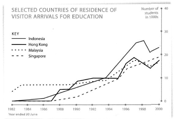
Tips for Organising an IELTS Line Graph
Organising an IELTS Line Graph - This lesson shows you have to improve the coherency of your graph in order to achieve a high band score.
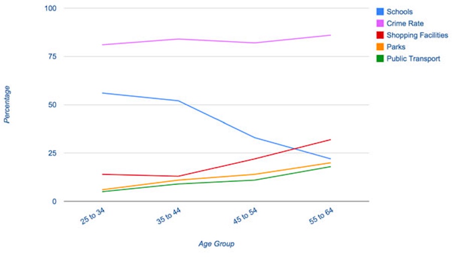
IELTS Task 1 Line Graph Structure Using Groups
For an IELTS Task 1 Line Graph there are different ways to organise your answer. Grouping information is a good way to get a logically structured response.
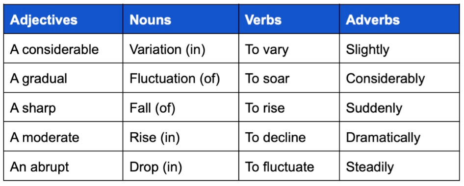
Useful Language for IELTS Graphs
This useful language for IELTS graphs looks at phrases for introducing graphs and describing changes
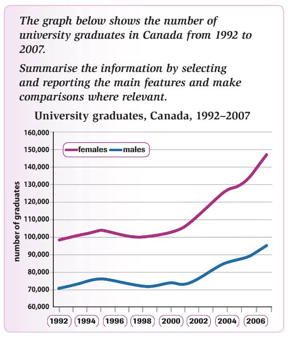
Lesson on Writing IELTS Line Graphs
This lesson on writing IELTS line graphs provides you with the skills to write a high scoring graph.
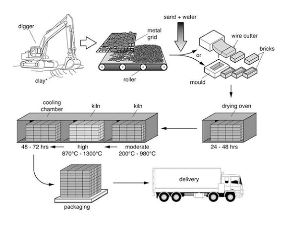
IELTS Process Diagram Strategies and Tips
IELTS Process Diagram: In task 1 of IELTS writing you usually have to describe some kind of graph or chart. But sometimes you get a process. It is therefore crucial that you know how to do this. This easy to follow lesson explains how.

Describing IELTS Graphs: Tips to avoid a common mistake
IELTS Graphs: A common mistake In IELTS graphs is to get the subject of the graph wrong. This lesson explains how this mistake is made and show you what you need to do to avoid it. There is a also a practice exercise.
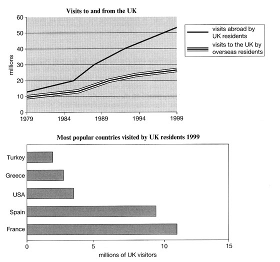
IELTS Bar and Line Graph: How to describe two graphs together
This Bar and Line Graph example shows you how you can write about two charts together in the IELTS test for task 1, with strategies and techniques.
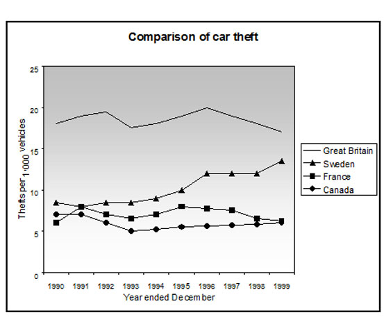
Prepositions in Graphs Quiz: Between; from; to; at; of; in; with; by
Prepositions in Graphs: Practice using prepositions in the IELTS test. View a model answer and practice using a gap fill.
Any comments or questions about this page or about IELTS? Post them here. Your email will not be published or shared.
Band 7+ eBooks
"I think these eBooks are FANTASTIC!!! I know that's not academic language, but it's the truth!"
Linda, from Italy, Scored Band 7.5

Bargain eBook Deal! 30% Discount
All 4 Writing eBooks for just $25.86 Find out more >>
IELTS Modules:
Other resources:.
- Band Score Calculator
- Writing Feedback
- Speaking Feedback
- Teacher Resources
- Free Downloads
- Recent Essay Exam Questions
- Books for IELTS Prep
- Useful Links

Recent Articles
Discourse Markers for IELTS Speaking
Nov 29, 24 03:15 AM
IELTS Podcasts
Nov 23, 24 04:09 AM
Online IELTS Listening Test Section 4
Nov 14, 24 02:35 AM

Important pages
IELTS Writing IELTS Speaking IELTS Listening IELTS Reading All Lessons Vocabulary Academic Task 1 Academic Task 2 Practice Tests
Connect with us
Podcast

Before you go...
30% discount - just $25.86 for all 4 writing ebooks.
Copyright © 2022- IELTSbuddy All Rights Reserved
IELTS is a registered trademark of University of Cambridge, the British Council, and IDP Education Australia. This site and its owners are not affiliated, approved or endorsed by the University of Cambridge ESOL, the British Council, and IDP Education Australia.
- A Beginner’s Guide to IELTS
- Common Grammar Mistakes [for IELTS Writing Candidates]
Writing Correction Service
- Free IELTS Resources
- Practice Speaking Test
Select Page
How to Describe a Bar Chart [IELTS Writing Task 1]
Posted by David S. Wills | Apr 13, 2020 | IELTS Tips , Writing | 5
There are various kinds of diagrams and charts that you may be asked to describe in the IELTS writing test, and one of those is the bar chart . In today’s lesson, I want to share some important advice that can help you improve your writing performance in your next IELTS test.
Describing data for task 1 of the IELTS writing exam is quite difficult and it will vary according to what you actually see. In other words, it is hard to simply teach some language for describing bar charts… Instead, your language will vary according to what the bar chart shows.
However, in this article I am going to break the process down and show you some examples so that you can understand it fully. At the end, I will give you a sample band 9 answer for a really difficult bar chart about people’s weight.
What are Bar Charts?
First of all, let’s start with the most basic question. You can feel free to skip this if you are already totally familiar with it. 😁 What is a bar chart? Basically, it is a visual representation of data using bars, like these:
Bar charts are used to show the difference between volumes or quantities of things because it is easy for the human eye to interpret. Let’s take a look at this example bar chart. I just found it on Google and will use it because it is simple. This is not a real IELTS chart. 🤪
You can easily see what this means. The most common excuse is “I forgot to set my alarm” and the least common is “It was still too dark; I thought it was still night-time.”
That is the purpose of a bar chart. It shows data in a way that is really easy for people to understand. As such, you may encounter it in your IELTS test. In that case, you will have to pick out the most important data and describe it.
Bar Charts for IELTS Writing
As we have seen, a bar chart is just another way of expressing data. For task 1 of the IELTS writing test, you may be asked to write about a bar chart. You will have to write more than 150 words and it is recommended that you do this in 20 minutes or less. (You will have a total of 1 hour for 2 tasks.)
It is important to note that you do not have to describe everything in the chart . Part of the task is picking out and describing only the relevant details. That usually means:
- The highest
- Major differences
- Anything interesting
What does that mean? This is very subjective, and so it is certainly open to debate. Let’s look at an example in order to understand it better:
In this bar chart, our eyes are naturally drawn towards the highest and lowest figures. The highest was in Sweden in 2012 and the lowest was in Finland in 2012. Therefore, both the highest and lowest figures occurred in the same year. That’s interesting!😅
Another interesting factor is that, in every year except one, Sweden had a higher divorce rate than Finland. It was only in 2015 that Finland’s divorce rate was higher than Sweden’s.
The Process
When you need to describe a bar chart for IELTS, you should take the same basic process as for describing anything else:
- Take time to read the question carefully.
- Look at the data and make sure you understand it.
- Find important data to describe.
- Plan your essay structure.
- Write your essay carefully.
- Check your answer for mistakes.
If you follow this basic routine, you will have a good chance of providing a strong answer to the question.
Language for Describing Bar Charts
In the past, I have talked about the language required to describe the following IELTS writing task 1 assignments:
- Process diagram
Bar charts are a little different because the language you would use depends on what is being described and there is no common set language that you would use just to talk about bar charts in general.
In the previous example, we can see that the bar chart features changing data over time. In such cases, we can use relatively similar language to that which we used for line graphs. You could say, for example:
Divorce rates in Sweden peaked in 2012 at a little under 50%, but fell in each of the subsequent years.
However, you can see that in the first bar chart there was no progression of time, so you cannot use language that shows changes in data. This brings us to the next stage…
Common Problems in Describing Bar Charts for IELTS
I used to teach writing skills at a university in China, and one of the most common problems I would have was teaching my students to write about bar charts. They could describe line graphs really easily, but the problem was that they would use the same expressions and structures for bar charts, when in fact something different was needed. Let’s look at two example charts. These contain similar data but there is an essential difference:
You can see that the line graph talks about changing phone prices over time, whereas the bar chart shows the different prices of phones. These prices are all taken from the same point in time .
Therefore, in order to adequately describe these, you must show that you understand the data.
For the line graph, you can say:
The price of Phone A rose from £380 to £410 between December and January.
However, you cannot use this language for the bar chart:
INCORRECT: The price rose from £380 for Phone B to £410 for Phone C. CORRECT: Phone C cost £30 more than Phone B, which cost £380.
This may seem easy to some people, but it is an important distinction and a common mistake. You should practice often to make sure that you know the difference.
Task 1 Essay Structure
There is no single perfect essay structure for IELTS, but there are some that are better than others. For task 1, I generally recommend writing an essay like this:
Let me explain what I mean by that.
It is really important to group your data appropriately. This can be quite difficult, so you should read this article first.
Essentially, you need to choose how to put groups of data together. Let’s take another example:
The chart below shows the total number of minutes (in billions) of telephone call in the UK, divided into three categories, from 1995-2002. Summarise the information by selecting a reporting the main features, and make comparisons where relevant.
For this sort of bar chart, you might choose to write two or three body paragraphs. Perhaps you would describe local fixed line phones first, then start a new paragraph for national and international ones, with another paragraph for mobiles.
Another way would be to break the data in half – one paragraph for 1995 to 1998 and another paragraph for 1999 to 2002.
There are lots of different ways. The only really important thing is that you make it clear to your reader why you have chosen to group the data this way. In other words, it must be logical .
Sample Answer
My answer to this question would look something like this:
The bar chart shows the time spent on three different kinds of phone calls in the United Kingdom over a period of eight years, starting in 1995 and ending in 2002. Local calls were the most common type of phone call made during the entire period, although both national/international and mobile calls grew in popularity to narrow the gap between these three types of call by 2002. In 1995, local calls were by far the most common type of phone call in the UK, with more than 70 billion minutes recorded on this chart. This is about double the amount of time spent on national and international calls, and more than ten times as much as was spent on mobile phone calls. All three types of phone calls grew in popularity until 1999, after which local calls decreased year-on-year until they ended the period at around the same figure as they began it – 70 billion minutes. National and international calls grew steadily over the recorded eight years, from about half the popularity of local calls to only slightly less in 2002. Mobile phone calls, however, grew ten-fold from about four billion minutes to more than forty billion.
A Really Difficult Bar Chart
Finally, let’s look at a difficult bar chart in order to show how we can tackle challenging problems.
As you can see, the first problem is that there are two charts! Already, that will prove more difficult than describing just one chart.
Another issue is that these bars look strange. They are all the same size… Why? Well, these represent the population. Each one is 100%, with the colours making up the different weight categories. The total can never be more than 100% because that it is the full population.
Now, you should try to interpret the data. What are the main changes?
- In 1955, there are lots of people at an ideal weight and very few people are obese.
- In 2015, many older people are obese. Fewer people are at an ideal weight.
- The weight distribution was similar regardless of age in 1955, but in 2015 it is very different.
Once you have picked out the important data, you should figure out how to structure your answer. I will use this structure:
However, I will make sure that there are clear comparisons between the 1955 and 2015 data. It is not enough to describe them in isolation.
Language for Talking about Age and Weight
To be honest, the hardest part of this bar chart is not that data but the terminology around age and weight. You can see from the chart that were are looking at age groups and weight groups. Many native speakers find this really difficult to talk about.
When we talk about age and weight, we usually say some form of “to be” rather than “to have.” For example:
- INCORRECT: In 2015, a higher percentage of people had overweight or obesity than in any other group.
- CORRECT: In 2015, a higher percentage of people were overweight or obese than in any other group.
- INCORRECT: In both years, the people who were most likely to be an ideal weight had 20 to 29 years.
- CORRECT: In both years, the people who were most likely to be an ideal weight were aged 20 to 29 years.
You can see how I explained this to one of the students on my writing correction service :
There are also problems with grouping people according to age. We can just say “people in the ___ age group/category” but this becomes repetitive after a while, so we need to use different language.
Talking about age is difficult, especially when describing groups of people who fall into different age categories. One thing to know is that, when you say use numbers, it is a sort of adjective and thus you need a noun to follow it or else it is meaningless:
- The criminals arrested were all 16 to 25 years old.
- I saw a 15-year-old boy running away.
You can turn the “old” into a noun by adding an “-s”:
- There was an increase of 25% in the unemployment rate for 20-29-year olds.
You can also put “aged” before the numbers:
- Most of the recipients were aged 18-22.
Sample Band 9 Answer
Here is my description of the bar chart above:
There are two bar charts showing the distribution of weight categories for people living in Charlestown. The first one is from 1955 and the second is from 2015. It is clear that vast changes have occurred in people’s health during this sixty year period. In 1955, very few people were overweight or obese, and most were healthy or even underweight. In each of the age groups, at least half of people were classified as in the ideal weight range, but towards the ends of the spectrum – the youngest and the oldest people – there were more people who fell into the underweight bracket. Being overweight or obese was a problem primarily affecting middle aged people, but not the most elderly ones. However, this distribution had completely changed by 2015. Although some young adults and elderly people remained underweight, a very slim number in the middle of the age groups did. Being overweight had become increasingly common, and obesity had become a huge issue, affecting people more and more as they got older. For people aged fifty and older, more than half suffered from obesity, and very few fell into a healthy weight range.
Useful Language
I will excerpt some of the useful phrases that appeared in this answer so that you can see how I have managed to describe ages and weights:
- very few people were overweight or obese
- most were healthy or even underweight
- at least half of people were classified as in the ideal weight range
- people who fell into the underweight bracket
- Being overweight or obese was a problem
- elderly people remained underweight
- Being overweight had become increasingly common
- obesity had become a huge issue
- more than half suffered from obesity
- very few fell into a healthy weight range
This was a really difficult bar chart to describe, but using this language I have managed to do it accurately and comprehensively.
Improve your Writing
If you want to get better at IELTS writing, the only way to ensure constant progress is by having an expert give you feedback. Most of the writing correction services that you find online are rubbish. They are run by people do not speak much English or do not understand IELTS. My writing correction service is one of the few that is truly worthwhile. I can tell you all your problems and help you to fix them.
Here is my feedback to someone who wrote an essay about the Charlestown weight distribution bar charts:
Let me know in the comment section if you have any questions. 🙂
About The Author
David S. Wills
David S. Wills is the author of Scientologist! William S. Burroughs and the 'Weird Cult' and the founder/editor of Beatdom literary journal. He lives and works in rural Cambodia and loves to travel. He has worked as an IELTS tutor since 2010, has completed both TEFL and CELTA courses, and has a certificate from Cambridge for Teaching Writing. David has worked in many different countries, and for several years designed a writing course for the University of Worcester. In 2018, he wrote the popular IELTS handbook, Grammar for IELTS Writing and he has since written two other books about IELTS. His other IELTS website is called IELTS Teaching.
Related Posts
Describe a Person You Know Who Dresses Well
June 13, 2022
How to Describe a Photo (IELTS Speaking)
September 4, 2017
The Countryside [IELTS Topics]
December 6, 2018
9 Ways to Improve your Language for IELTS
May 7, 2016
Hi, David. I noticed that you didn’t include any figures at all in your sample answer for the weight assessment. Is that acceptable? This is because I have seen some IETLS teacher who taught us to include most of important figures. Thank you.
The important thing about IELTS is that it is an English test, so you should use your language to describe the data. Most candidates attempt to cram lots of numbers in so that they can use fewer words. The fewer numbers you use, the better. Sure, you can have one or two, but if you are able to use words to describe trends, reflect important data, or make comparisons, then it is much better. If you read my essay carefully, you will notice that I said things like “at least half of people” rather than just repeating numbers. This is a good strategy, although you can certainly put in a few numbers if you want.
Hi David. Thank you for your explanation. I have a question! for describing a chart what verb tens we should use? It depends on something or it has a rule! Thank you.
It depends on the situation. Pay attention to any time frame that is given or the origin of the data. If none is given, then present simple is fine.
Asalam O Alakum David
Can we explain only things in overview except figures, percentage and time trend? I mean only what they have mentioned in the picture.
Secondly, in last 2 paragraphs only should we write those things which they have showed in the graph, chart or map in a simple way.\
Please, confirm me.
With regards
Leave a reply Cancel reply
Your email address will not be published. Required fields are marked *
This site uses Akismet to reduce spam. Learn how your comment data is processed .
Download my IELTS Books
Recent Posts
- Verb Tenses and IELTS Maps
- How to Write an Overview for IELTS Writing Task 1
- Cambridge IELTS 19 – Sample Answers
- Commas and Time Phrases
- Ambition and Success: Sample IELTS Essay
Recent Comments
- David S. Wills on How to Write an Introduction for IELTS Writing Task 2
- Uday on How to Write an Introduction for IELTS Writing Task 2
- David S. Wills on How to Write a Positive or Negative Development IELTS Essay
- ELAINE on How to Write a Positive or Negative Development IELTS Essay
- David S. Wills on Writing Correction Service
- Lesson Plans
- Model Essays
- TED Video Lessons
- Weekly Roundup

Useful Vocabulary for Writing an IELTS Graph Essay

When it comes to IELTS writing task 1, 25% of your marks are for the range of words you use. That means IELTS graph vocabulary is a very important component to review as you prepare for the Writing Task 1. You can start by checking out this IELTS writing task 1 vocabulary guide . And below, I’ll provide an overview of words and useful phrases to incorporate into your writing so that you can get top marks on the lexical resource category and a high band score overall. Basically, the better your IELTS writing chart vocabulary, the higher score you’ll get. It’s not hard, but there is a clear formula to doing well.
How to Use IELTS Graph Vocabulary in Writing Task 1
Because IELTS writing task 1 involves describing a graph or chart of some type, it will help to have a handle on IELTS writing chart vocabulary — words and phrases that help you write about the information on the chart or graph.
How are graphs described in IELTS? Let’s walk through the best vocabulary for the task, step by step.
1. Start With Introduction Phrases
Often ESL students start their essay with ‘The graph shows…’. While this is fine, the verb ‘shows’ could be replaced by a more exciting and high-level vocabulary word. Here are four different prompts to start your essay:
- The graph illustrates the trends in…
- The graph reveals information about the changes in…
- The graph provides the differences between…
- The graph presents how X has changed over a period of…
- DO NOT write the word below or above in your introduction. i.e. The graph above/below shows…
2. Add Suitable Adverbs
Adverbs help express a relation of place, time, circumstance, manner, cause, and degree, and can greatly add some color and interest to your writing as well as show off your range of vocabulary. Unlike adjectives (which describe nouns), adverbs describe verbs, or actions. Here’s a great list of adverbs to use:
3. Use Appropriate Synonyms
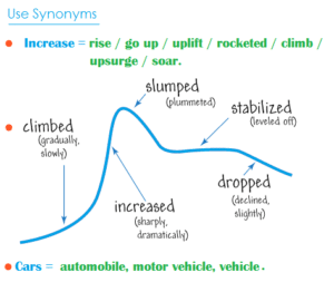
Again using a variety of nouns and verbs for words like rise and fall will help increase your overall score. Here are some suggestions:
4. Add Time Phrases
Below are some excellent time phrases with sentence examples:
Using IELTS Graph Vocabulary in a Model Essay
Look at the sample IELTS writing Task 1 graphs on the British Council website . Below is my model answer with useful words in bold:
The bar charts illustrate the trends in computer ownership, with a further classification by level of education, from 2002 to 2010.
Over the period, it can be observed that there was a significant surge in the percentage of the population that owned a computer. In the year 2002, only about 58% of the population owned a computer, whereas by 2010 , this gradually increased to where over three-quarters of individuals had a home computer.
Looking at the information by level of education reveals that higher levels of education correspond to higher levels of computer ownership in both of those years. In 2002, a significantly low percentage of the population who did not finish high school had a computer, but this figure skyrocketed by 2010, going from 15% to over 40%. There were also dramatic climbs , of approximately 30 percentage points, for those with a high school diploma or an unfinished college education (reaching 65% and 85%, respectively, in 2010).
To conclude, during the last decade, there has been a substantial growth in computer ownership across all educational levels.
Other IELTS Graph Vocabulary Resources
Keep in mind that IELTS writing task 1 may contain one of several different types of infographic: a bar chart, pie chart, line graph, diagram, etc. Regardless of the type, you’ll want to have a good handle on IELTS writing chart vocabulary.
For more specific guides to the different kinds of graphs, charts, and graphics you may find on IELTS writing task 1, check out the following resources:
- How to Describe a Bar Chart
- How to Describe a Pie Chart
- How to Describe a Map
- How to Describe a Process Diagram
You can also check out Magoosh’s IELTS linking words PDF for transitions between ideas. Hopefully you’ll start to incorporate some of these key words and phrases, as well as the above suggestions, in your IELTS Task 1 Writing. If you still don’t feel comfortable doing so, consider dedicating more time to your IELTS studies with Magoosh’s fun, engaging IELTS prep for extra practice.

Eliot Friesen-Meyers is the Senior Curriculum Manager for Magoosh IELTS and TOEFL. He attended Goshen College (B.A.), New York University (M.A.), and Harvard University (M.T.S.), gaining experience and skills in curriculum development, ESOL instruction, online teaching and learning, and IELTS and TOEFL test prep education. Eliot’s teaching career started with Literacy Americorps in Pittsburgh, Pennsylvania, and later, taught ESL programs at Northeastern University, University of California-Irvine, and Harold Washington College. Eliot was also a speaker at the 2019 TESOL International Conference . With over 10 years of experience, he understands the challenges students face and loves helping them overcome those challenges. Come join Eliot on Youtube , Facebook , and Instagram . Recent blog posts Complete Guide to IELTS Writing Task 1 Complete Guide to IELTS Writing Task 2
View all posts
More from Magoosh

Leave a Comment
Please leave any questions or suggestions in the comments, we try our best to respond within a few days! Your email address will not be published.
11 responses to “Useful Vocabulary for Writing an IELTS Graph Essay”
I would like to get sample of all types of graph eassy
IELTS Liz offers a pretty good range of graphs and charts for IELTS Writing Task 1 (Academic) . You can also get a nice selection of these on the official IELTS websites . And last but not least, Magoosh offers a good selection of these types of questions with a Magoosh IELTS Premium subscription. 🙂
Thank you Magoosh for the comprehensive guide. I’m a subscriber to you GMAT course and is now checking out IELTS.
Wanna ask, I read and watched many other sources that says we should not write a conclusion. However, yours did.
So, is it permissible or not permissible?
The concluding sentence is optional–if you have time to write a concluding sentence after writing and reviewing your essay, then it looks good to have a concluding sentence. If you don’t have time to write a concluding essay or you’d rather focus on other parts of your essay, then it’s totally fine to leave it out. You can read more about this in our Complete Guide to IELTS Academic Writing Task 1.
“Growth” is not an noun? Because in the board it’s saying that it is a verb
Thanks for pointing this out! It seems like a mistake on our part. We should probably change that to “grow”. I’ll make a note for our writing team to make this change 🙂
I appreciate you very much. Your blog on Useful Words for Writing an IELTS Graph Essay was the outstanding blog ever. You have given so much good information about the new english words & grammar in your post, which will help me in future. Always keep data like this on your website
I have two significant questions. The first one is related to the unit of measurement in over view. Is it academic? And the second one is of conclusion. Do we need to write conclusion?
Hi Aakash, I’m afraid I don’t understand your first question. Can you please provide some more information? For your second question: a conclusion is not necessary. You can add one if you’d like, but it’s more important to spend time analyzing the graph.
This is one of the best among the essay I’ve read recently.
Thanks for the feedback! 🙂
Leave a Reply Cancel reply
Your email address will not be published. Required fields are marked *
The firewall on this server is blocking your connection.
You need to contact the server owner or hosting provider for further information.
Your blocked IP address is: 66.249.64.20
The hostname of this server is: premium25.web-hosting.com
You can try to unblock yourself using ReCAPTCHA:

IMAGES
COMMENTS
11 Ways to Describe a Graph in Writing. Now let’s go through 11 ways that I’ve found to clearly and cleverly describe graphs in all your writing. Shape. Describing the graph’s shape provides immediate visual insight into trends and patterns. A linear trend suggests consistent data, while a curved line indicates shifts in growth rate.
The other paragraphs should describe the patterns or trends in more detail. However, only select the most important ones to write about, and don't write about your own ideas. Use linking words and a range of vocabulary to describe what you see in the charts. (You can write % or per cent, but be consistent.)
Line graphs can also be used to compare multiple dependent variables by plotting multiple lines on the same graph. Example of an XY line graph: Figure 5. Age of the actor of each Doctor Who regeneration (1-11) The line graph shows the age (in years) of the actor of each Doctor Who regeneration for the first through the eleventh regeneration.
Analyse and evaluate the graph / chart / table using language sheet 1. You must follow the 3 key stages (describe the key elements (labelling), analysis and evaluation). You may need to do some internet research to help your understanding / evaluation. Give a 2-minute presentation of your graph using your own analysis and evaluation.
Introduce the graph; Give an overview; Give the detail; We’ll look at each of these in turn. Introduce the Graph. You need to begin with one or two sentences that state what the IELTS writing task 1 shows. To do this, paraphrase the title of the graph, making sure you put in a time frame if there is one. Here is an example for the above line ...
Oct 31, 2022 · In IELTS writing task 1, you will be asked to describe some sort of visual data. It could be a line graph, a bar chart, a table, a map, a pie chart, or a process diagram. (Here’s a full list.) In this article, we’re going to ignore some of these and look at how to describe a graph.
Apr 13, 2020 · When you need to describe a bar chart for IELTS, you should take the same basic process as for describing anything else: Take time to read the question carefully. Look at the data and make sure you understand it. Find important data to describe. Plan your essay structure. Write your essay carefully. Check your answer for mistakes.
May 4, 2021 · Here are four different prompts to start your essay: The graph illustrates the trends in… The graph reveals information about the changes in… The graph provides the differences between… The graph presents how X has changed over a period of… DO NOT write the word below or above in your introduction. i.e. The graph above/below shows… 2.
To decide which tense(s) to use for describing a graph, you need to find out whether there is a time element to the graph. Is it the past, the present or the future? Don’t forget to look at the title of the graph to see what time it relates to. If no time is given, you can presume that the data are current (see the graph in Task 1).
Dec 22, 2019 · Introduce the graph; Describe the graph details; Make a short comparison; Write a conclusion ; Introduce the graph/chart: You need to start writing with one or two sentences to introduce the graph briefly. You should state here, in fact, what the graph shows and what you see at a glance according to the title. Describe the graph/chart details: