Home Blog Business How to Create an Appealing Report Presentation (Guide + Templates)

How to Create an Appealing Report Presentation (Guide + Templates)
Sharing data, insights, and recommendations extracted from detailed analysis is a practice that consultants and heads of departments view as part of their everyday workload. Yet, effective communication techniques make a difference in whether the information disclosed is actionable, makes a lasting impact, or becomes critical for a decision’s outcome.
In this article, we will guide you through the process of creating a good report presentation, from general aspects to specifics by niche, recommended PowerPoint templates to use, and which aspects you should avoid in the presentation design process.
What is a Report?
What is a report presentation, business report presentations, academic report presentations, technical report presentations, sales report presentations, marketing report presentations, project report presentations, non-profit and ngo report presentations, healthcare report presentations, environmental report presentations, do’s and don’ts on a report presentation, recommended report powerpoint templates.
A report is a formal, high-level document that compiles data, research findings, and recommendations tailored to a specific topic. Its core purpose is to grant stakeholders a detailed understanding of a situation and provide background for decision-making processes.
We can define a report presentation as the visual and verbal method of communicating the key elements of a written report. Typically, report presentations happen in meeting or conference settings, where the scale of the report presentation depends on any of these three factors:
- Topic of the report presentation
- People or teams involved in the outcome of the report
- People or teams that must be aware of the information retrieved from the report
Depending on its topic, the amount of slides or specific slide design to include, which we shall mention in the upcoming section.
Types of Report Presentations
Business report presentations focus on a business’s performance, strategy, and operations, conveying important information to stakeholders for decision-making purposes. These presentation slides are used during board meetings, business plan presentations , quarterly reviews, strategic planning sessions, and investor meetings.
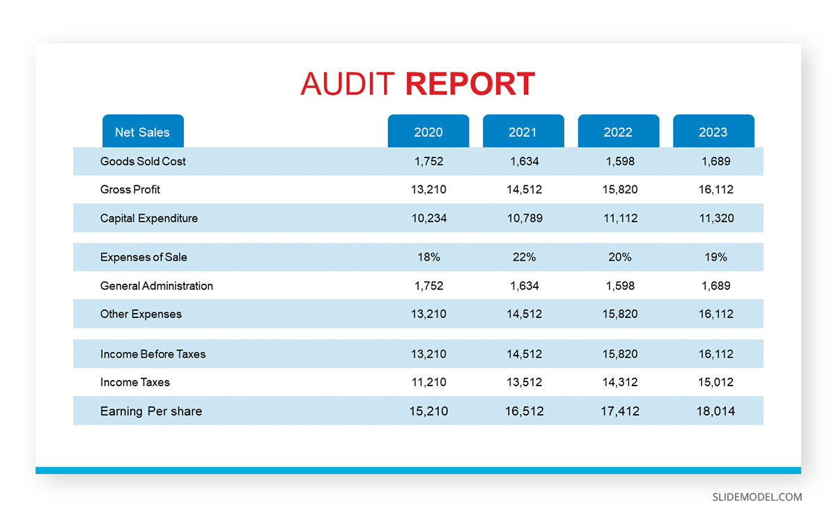
A typical business report presentation should contain the following slides on its slide deck:
- Title Slide : Title, presenter’s name, date, and company logo.
- Agenda Slide : Outline of main sections.
- Executive Summary Slide : Key takeaways and highlights.
- Financial Overview Slide : Revenue, expenses, profit, and loss.
- Performance Metrics Slide : Key performance indicators (KPIs).
- Strategic Initiatives Slide: Current and future projects.
- Market Analysis Slide : Market trends and competitive analysis.
- SWOT Analysis Slide: Strengths, weaknesses, opportunities, and threats.
- Recommendations Slide : Suggested actions and next steps.
- Q&A Slide : Invite questions from the audience.
- Conclusion Slide : Summary of key points.
Presenters must generally focus on clearly expressing the key points and insights, using charts and graphs to illustrate their findings easily. Opt for a SWOT analysis PowerPoint template to simply the SWOT representation process.
Academic report presentations communicate research findings, project outcomes, and scholarly work to academic peers and professionals. They are common at academic conferences, seminars, workshops, and in classrooms (post-graduate settings).
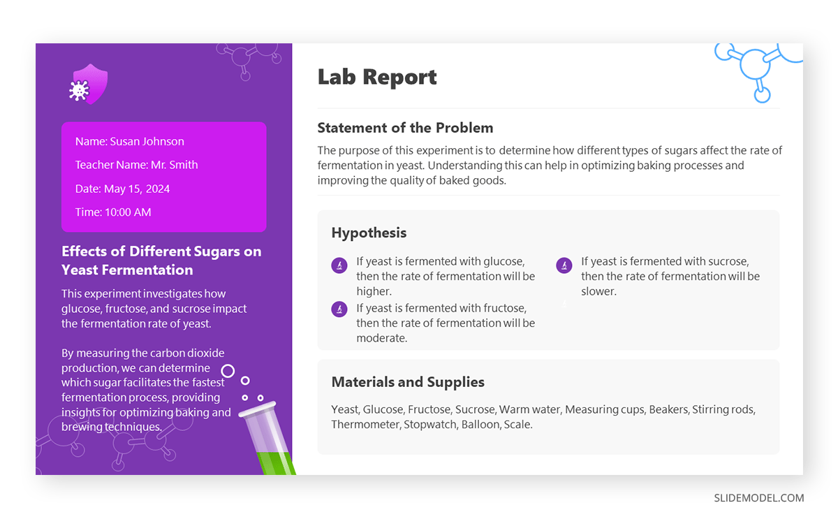
To build a high-quality academic report presentation, consider the following slides:
- Title Slide: Title, author’s name, institution, and date.
- Introduction Slide: Background and research question.
- Literature Review Slide: Summary of relevant research.
- Methodology Slide : Research methods and design.
- Data Slide: Key data and statistics.
- Analysis Slide: Interpretation of data.
- Results Slide: Main findings.
- Discussion Slide : Implications and significance.
- Conclusion Slide: Summary of findings and future research directions.
- References Slide: List of sources and citations.
- Q&A Slide
Avoid jargon at all costs unless specifically required by your tutor. Aiming to create an interactive presentation out of it can be a plus.
Technical report presentations detail technical data, research findings, and project updates (i.e., project status report templates ) to a specialized audience, often in fields like engineering, IT, and science. They are used in technical meetings, conferences, project updates, and during product development cycles.
The slides a technical report presentation should include are:
- Title Slide
- Problem Statement Slide: Definition and scope of the problem.
- Objectives Slide: Goals of the technical work.
- Methodology Slide: Technical approach and procedures.
- Data Slide: Key data points and measurements.
- Analysis Slide: Interpretation of technical data.
- Results Slide: Main findings and outcomes.
- Technical Challenges Slide: Issues encountered and solutions.
- Recommendations Slide: Suggested actions based on findings.
- Future Work Slide: Next steps or future research.
- Conclusion Slide
Diagrams, infographics, and graphs are handy for explaining complex data. Presenters should encourage the audience to ask questions about the topic and break down the complex elements into easy-to-understand chunks of information.
Sales report presentations provide insights into sales performance, trends, and forecasts to understand market conditions and sales strategies . Presenters who are looking how to make a presentation in the sales niche can apply it for sales meetings, quarterly reviews, strategy sessions, and performance evaluations.
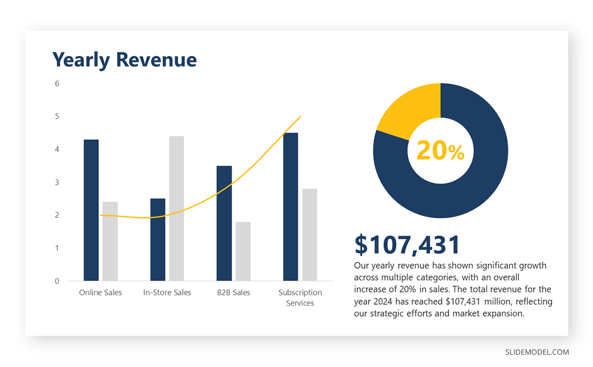
A successful sales report presentation features the following slides on its deck:
- Agenda Slide
- Sales Performance Slide: Sales figures and trends.
- Target vs Actual Slide: Comparison of targets and actual sales.
- Sales by Region/Product Slide: Breakdown of sales data.
- Sales Pipeline Slide: Status of sales leads and opportunities.
- Customer Insights Slide: Key customer trends and feedback.
- Competitor Analysis Slide: Competitive landscape.
- Strategies Slide: Current and future sales strategies.
- Recommendations Slide: Suggested improvements and actions.
As a recommendation, in our experience, it’s a good practice to include a sales dashboard slide highlighting the key sale metrics. It would be beneficial if a new sales strategy were implemented and the team wanted to extract conclusive data from it.
Marketing report presentations analyze marketing campaigns, strategies, and performance metrics to assess the impact and plan future initiatives. We can come across this kind of report and presentation in situations like marketing meetings, marketing plan presentations , campaign reviews, strategy sessions, and performance evaluations.
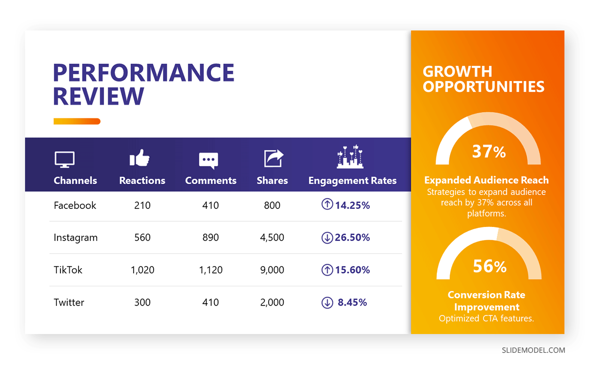
Consider to list the following slides to create an effective marketing report presentation:
- Campaign Overview Slide: Summary of marketing campaigns.
- Performance Metrics Slide: Key metrics like ROI, conversion rates, and engagement.
- Audience Insights Slide: Data on target demographics and customer behavior.
- Channel Performance Slide: Performance by marketing channel (e.g., social media, email).
- Competitor Analysis Slide: Competitive landscape and benchmarking.
- Strategies Slide: Current and future marketing strategies.
This is a type of report presentation where you should encourage audience participation due to the importance of the creativity factor in new campaigns. Use infographics to represent dense groups of data related to social media reports . Strategy presentation templates are also a good fit to enhance your report presentation slide deck.
Additionally, we include on this following link a Free Social Media Report PowerPoint template for users to create professional-looking slides in seconds.
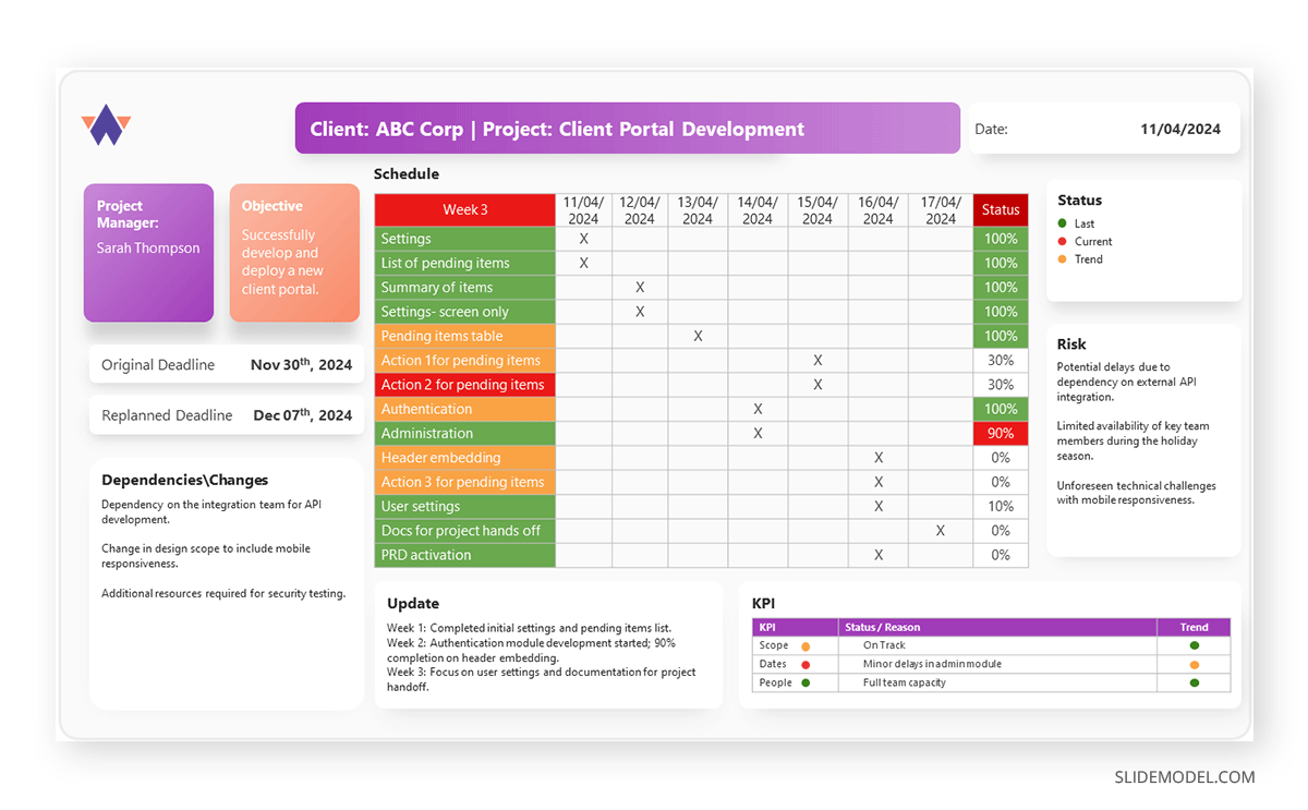
Project report presentations detail project progress, challenges, and outcomes, providing updates to stakeholders and ensuring alignment with goals. Typical use cases of these report presentations are project meetings, status updates, and post-project reviews.
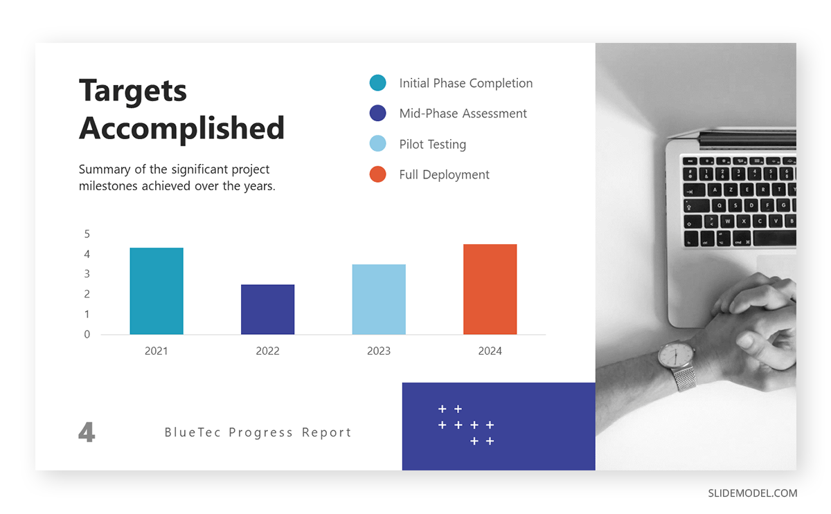
To create a slide deck for project report presentations, consider to include these slides:
- Title Slide: Title, presenter’s name, date, and project name.
- Project Overview Slide: Summary of project goals and scope.
- Timeline Slide: Key milestones and project schedule.
- Progress Slide: Status of project phases and tasks.
- Challenges Slide: Issues encountered and mitigation strategies.
- Budget Slide: Financial status and budget adherence.
- Risk Management Slide: Identified risks and their management.
- Next Steps Slide: Upcoming tasks and milestones.
Gantt charts , progress bars , and budget graphs are excellent presentation tools for showcasing key information in project presentations . Be sure to include the exact dates for project updates.
Non-profit and NGO report presentations highlight the organization’s activities, achievements, and financial status, communicating with donors, volunteers, and the public. They are a key element of transparency in relationships with the public and donors, and they are used in board meetings, fundraising events, annual reviews, and community outreach.
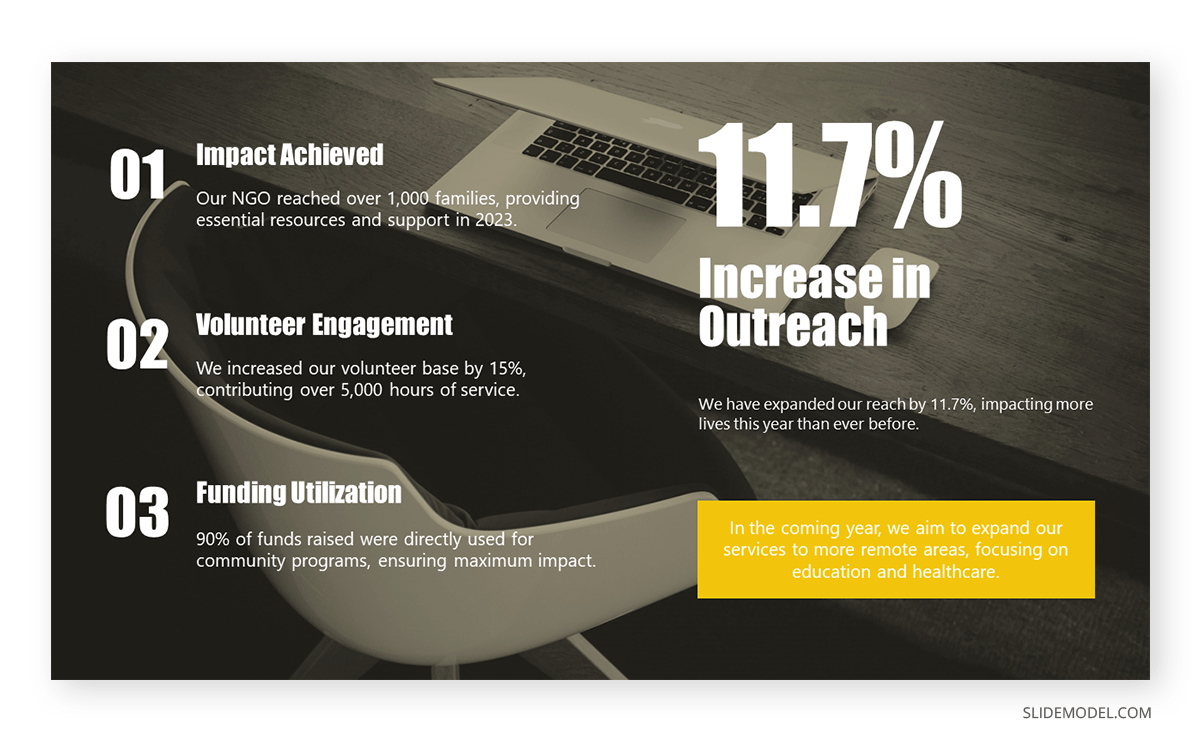
To create this kind of report presentation, we need to include these slides:
- Mission Slide: Organization’s mission and goals.
- Activities Slide: Summary of recent activities and programs.
- Impact Slide: Data on the impact and outcomes of programs.
- Financial Overview Slide: Income, expenses, and budget status.
- Donor Recognition Slide: Acknowledgment of key donors and supporters.
- Challenges Slide: Issues faced and solutions implemented.
- Future Plans Slide: Upcoming projects and initiatives.
Harness the power of storytelling . Include success stories, impact charts, infographics, and program photos. Highlight the outcomes and benefits this organization has brought to its target community. Annual Report PowerPoint templates can speed up the design creation phase of your report presentation.
Healthcare report presentations provide data on patient outcomes, research findings, and healthcare initiatives aimed at improving medical practices and policies. They are used in medical conferences, healthcare meetings, research symposiums, and policy briefings.
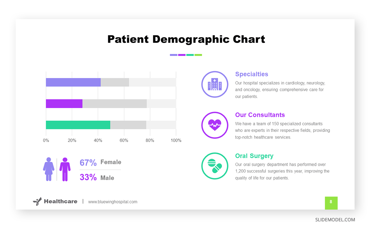
The slides we must count on for building an effective healthcare report presentation are:
- Background Slide: Context and objectives of the report.
- Methodology Slide: Research methods and data collection.
- Data Slide: Key statistics and findings.
- Analysis Slide: Interpretation of data and implications.
- Recommendations Slide: Suggested actions or policy changes.
- Future Research Slide: Areas for further investigation.
If you need to share a patient’s data concerning a newly developed technique or as findings from research, be sure you are authorized to disclose that information.
Finally, environmental report presentations focus on environmental research, sustainability projects, and ecological impact assessments to inform stakeholders and promote environmental protection. We can attend these kinds of presentations at ecological conferences, policy briefings, project reviews, and community meetings.
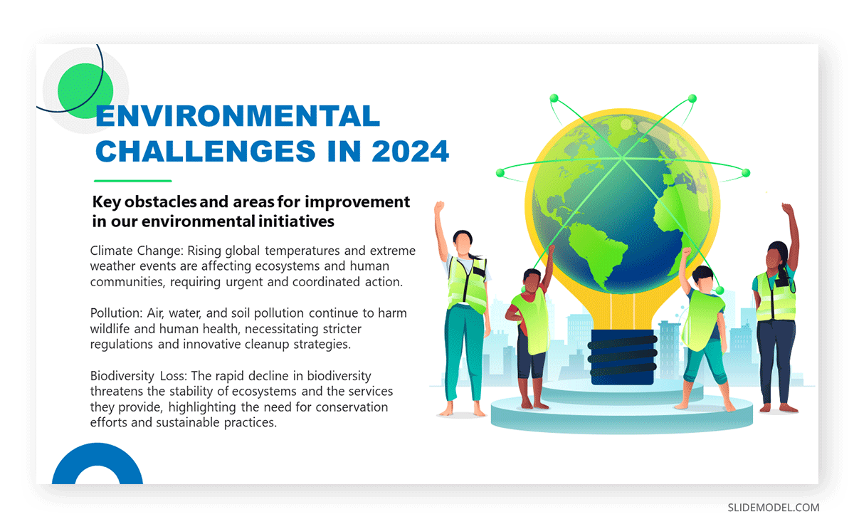
Include the following slides in your deck to create an outstanding environmental report presentation:
- Impact Slide: Environmental impact and sustainability metrics.
- Recommendations Slide: Suggested actions and policy changes.
Video presentations are ideal for adding an extra emotional factor and connecting with the audience about the importance of environmental causes, and they are also applicable to any kind of consulting report . Another key approach is to include testimonials from well-accredited sources or individuals affected by the environmental factor.
If you need a quick method to create a report presentation, check out our AI presentation maker . A tool in which you add the topic, curate the outline, select a design, and let AI do the work for you.
- Do start with a clear objective.
- Do use visuals to support your message.
- Do practice how to start your presentation .
- Do engage with your audience by asking questions and inviting feedback.
- Do end your presentation with powerful graphics
- Don’t overload slides with text.
- Don’t ignore your audience’s needs and interests.
- Don’t rush through the presentation.
- Don’t rely solely on the slides; use them to complement your speech.
How long should a report presentation be?
The length depends on the context and audience, but 15-30 minutes is a standard time for most report presentations.
What tools can I use to create a report presentation?
Common tools include PowerPoint, Google Slides templates , and Keynote. Specialized data visualization tools like Tableau can also be useful.
How can I make my report presentation more engaging?
Use storytelling techniques, interactive elements, and visual aids to engage your audience .
Should I distribute copies of the report?
It’s often a good idea to provide copies or a summary handout for the audience to follow along and refer to after the presentation.
In this section, you can find a list of curated report presentation slides to make your work easier. You can work with any of these designs or opt to use the ones presented above.
1. Expense Report Presentation Slide
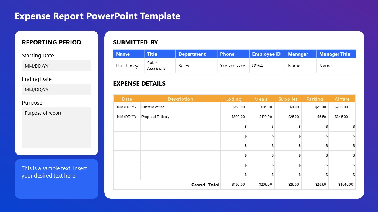
This Expense Report PowerPoint Template is perfect for detailed financial presentations. Easily document and display expenses, including lodging, meals, supplies, parking, and airfare, with clear sections for reporting periods, submission details, and expense descriptions. Ideal for corporate reporting, budget reviews, and financial audits, ensuring organized and professional presentations.
Use This Template
2. Business Progress Report Slides for PowerPoint
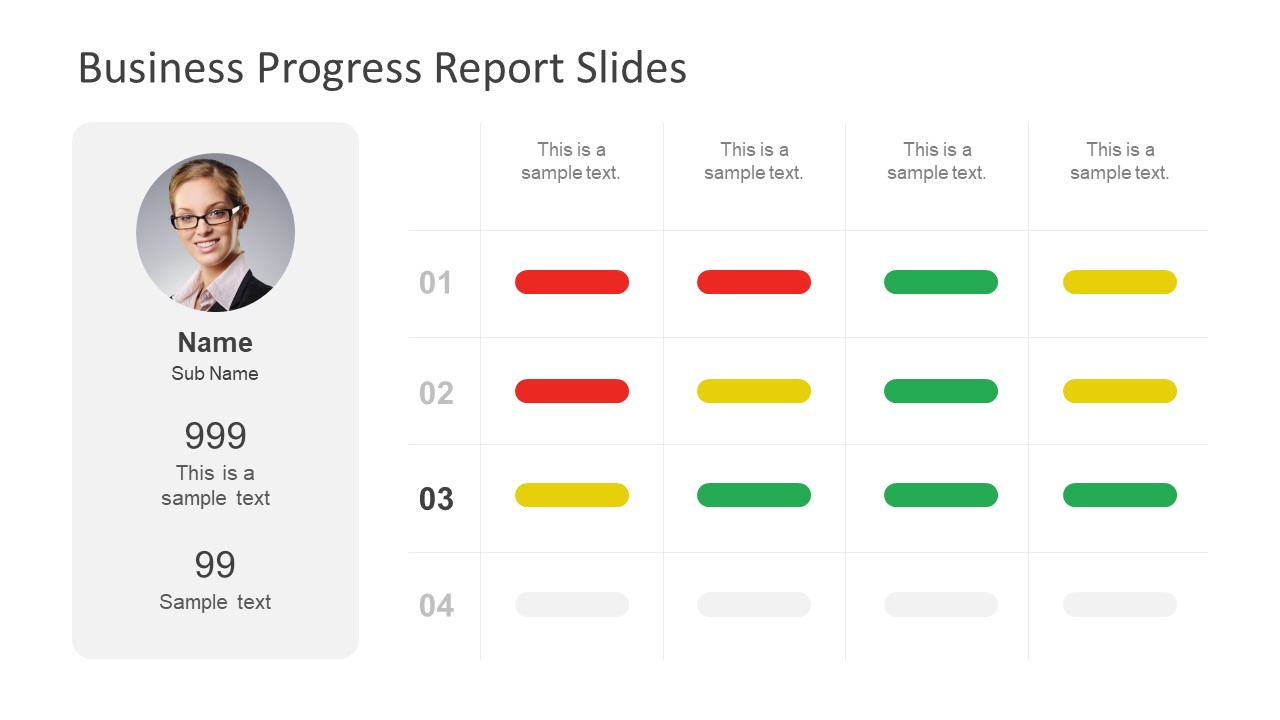
This Business Progress Report Template is designed to track project milestones and performance metrics. Listing a profile section for team members and a color-coded progress indicator allows for clear visualization of project status. It is ideal for team meetings, stakeholder updates, and performance reviews, ensuring a concise and effective presentation.
3. Book Report Presentation Slide Deck for PowerPoint
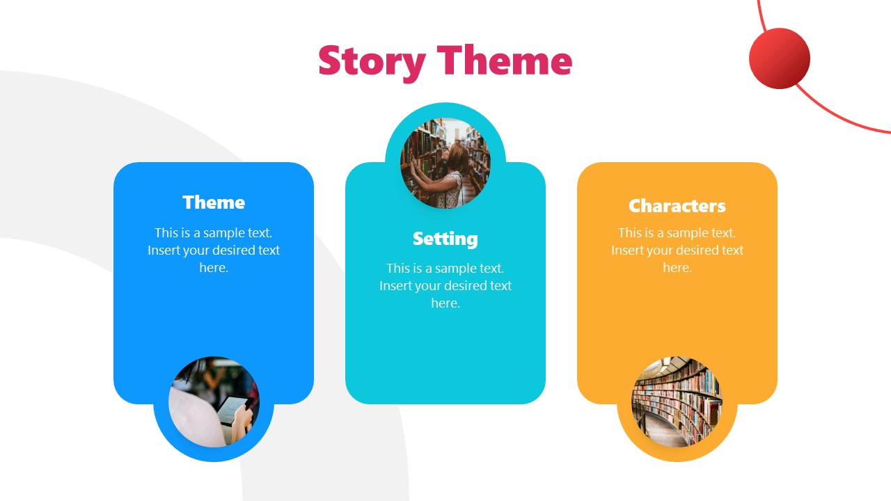
This Book Report PPT template is ideal for structuring narrative elements in presentations. We can outline a story’s theme, setting, and characters with visual aids to enhance understanding. This template is perfect for writers, educators, and marketers to convey story concepts effectively, ensuring a cohesive and engaging presentation.
4. Annual Report Template for PowerPoint
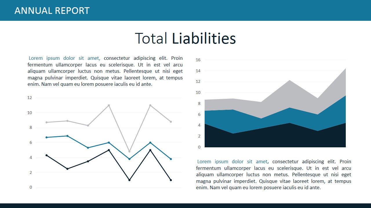
This Annual Report slide deck is designed for clear financial analysis. It features sections for detailed descriptions, bar charts, and pie charts to represent expense data visually. Perfect for financial reviews, investor presentations, and budget meetings, this template ensures a comprehensive and professional overview of total expenses, facilitating informed decision-making.
5. Business Annual Report PowerPoint Template
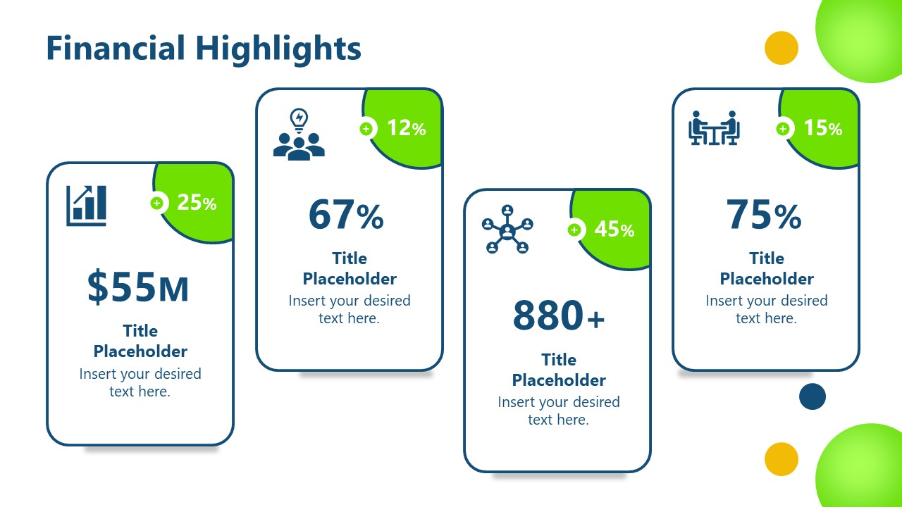
A slide deck designed to showcase key financial metrics and achievements. We include sections for displaying significant figures, percentages, and growth indicators, making it perfect for annual reports, investor meetings, and financial reviews. With clear and visually appealing graphics, this template ensures a concise and impactful presentation of financial performance highlights.
6. Financial Dashboard Report Template for PowerPoint
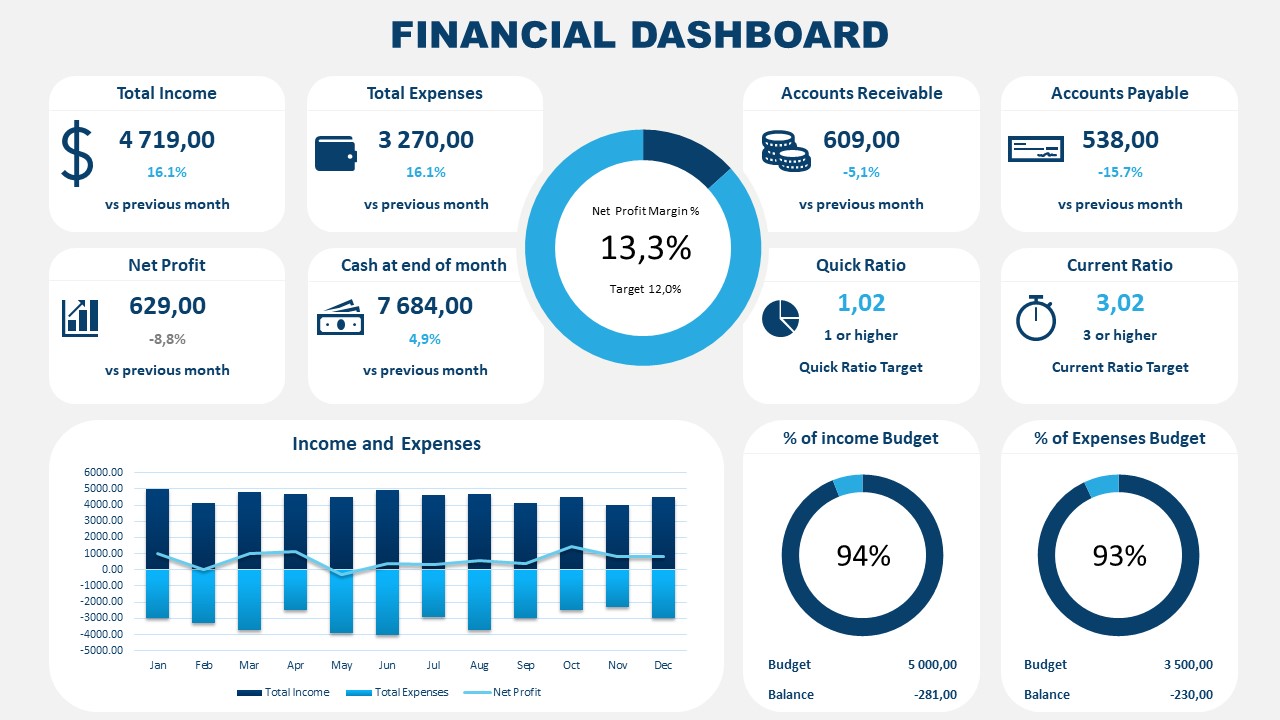
Accurately represent financial information that’s critical for your organization by implementing this PPT report template. It is a data-driven layout containing different boxes to showcase KPIs; managers and team leaders can use this template to align organizational efforts toward a strategic goal.
Like this article? Please share
Consumer Reports, Design, Executive Reports, Financial Report Filed under Business
Related Articles
Filed under Google Slides Tutorials • November 26th, 2024
Does Google Slides Have Design Ideas?
Is Google Slides able to help us define design ideas for our slide deck? Do we need extra plugins? Find all the answers here!
Filed under Design , PowerPoint Tutorials • November 15th, 2024
20 Best PowerPoint Fonts to Make Your Presentation Stand Out in 2025
Creating custom presentation slides from scratch is no easy feat, especially if you struggle to find proper font combinations. Discover the best PowerPoint fonts with this guide.

Filed under Design • November 11th, 2024
8 Best Canva Alternatives for Presentations in 2025
Don’t feel restricted about what one application can do for presentation design. Meet a list of the best Canva alternatives in this article.
Leave a Reply
👀 Turn any prompt into captivating visuals in seconds with our AI-powered design generator ✨ Try Piktochart AI!
25 Powerful Report Presentations and How to Make Your Own

If we are what we repeatedly do, then consultants are report presentations. In the words of veteran consultant John Kim , “If you cannot put together a well-structured, persuasive, and visual presentation… you won’t be a management consultant for long.”
Unfortunately, over 90% of consultant report presentations fail to make an impact, either because they don’t have enough content, have too much content, are unstructured, lack persuasiveness or in all honesty, are just plain boring.

You can know your data inside and out, and you couldn’t have a firmer grasp on the industry, but no matter how prepared or well-researched you are – even one bad slide can ruin great content. Not to mention, a poorly designed presentation can literally cost your department and your organization over $100,000 per year (conversely, a well-design presentation earns you significant advantages).
The good news is that you don’t need a swanky suite of tools or a big design team to overhaul your reports – there are tons of free and online resources for creating interesting, compelling, and seriously persuasive reports. Just sign up for a free Piktochart account and use any of the available slides templates to start easily.
So while the pyramid principle remains one of the best ways for structuring your presentation content, in this article we provide other top tips and insights you can use to create powerful slides that speak to your audience through 25 best practice examples.
Make Your Data Digestible
1. achieving digital maturity: adapting your company to a changing world by deloitte.
Click to view SlideShare
This deck ticks a lot of boxes when it comes to giving tips for powerful presentations. This report consists of an absolutely brilliant use of data visualization , a subtle “progress bar” at the top that reminds the audience which part of the presentation they’re at, and concise summaries accompanying each infographic. Here at Piktochart, it’s certainly one of the best report presentations we’ve swooned over in a while.
2. Digital globalization: The new era of global flows by McKinsey
There is an overwhelming amount of data here, but McKinsey does a commendable job of keeping it engaging with clear summaries and good-looking infographics (slides 30 & 42). Some slides might feel a bit more cramped than others (slide 41–49), but when creating your own reports you should try to save these huge chunks of data for an article or whitepaper that a client can download and peruse at their own leisure. Your presentation should only contain the highlights.
3. KPCB Design in Tech Report 2015: Simplified and Redesigned by Stinson
You’ll appreciate the brilliance of this presentation even more when you see the original . Instead of just inserting data in its raw form as graphs or tables, Stinson transforms their findings into something more graphic and appealing. The rest of the report also takes on a less-is-more principle, distilling only the most important points that would matter to the client – not the presenter.
4. The 60 Greatest Mobile Marketing Strategies of All Time by Leanplum
Leanplum only presents one point per slide, making their presentation supremely easy to follow along with (despite having 105 slides!). While they do use traditional line graphs and bar charts, they also find unconventional ways to illustrate their data (slides 71–77) or slip in nuggets of data that don’t detract from the main point (slides 52–53) – they use data to back their insights, rather than make the data the focus of the slide.
Clean Up Your Report Presentation Slides
5. findings on health information technology and electronic health records by deloitte.
Make use of white space and clean graphics to get your point across more effectively. This consulting deck does what most report presentations neglect, which is to highlight key takeaways (and bolding the important points) to avoid cluttering the audience with too much information.
6. Getting ready for IFRS 16 by KPMG

Clean and simple, each slide in this presentation has a clear focus, enhanced by the use of one question per slide and accompanying minimalist-style icons . It’s one of the easiest styles to replicate, and can be used strategically at certain portions of your presentation where you want to remove distraction and place emphasis on certain messages.
Choose the Right Fonts For Your Report Presentation
7. global retail trends 2018 by kpmg.

Crisp and clear, the choice of sans serif fonts keeps your report looking sleek, modern, and supremely legible when presenting. While your choice of font may be constricted by brand guidelines or house style, regardless, a good rule of thumb in your report presentation is to use clear, minimally-styled fonts so your message doesn’t get lost in a web of visual distraction.
Make Use of Report Presentation Visuals
8. how to use weflive 2017 by kpmg.

This presentation has been viewed over 87,500 times, making it a great example of what works in an educational deck. The use of screengrabs gives both current and potential clients better recognition of your services or products. It’s also been proven that visual elements attract clients better.
9. Top Ten Customer Airport Complaints by McKinsey
Smart use of custom illustrations and images helps audiences to instantly identify with each pain point. Good, relevant visuals amplify your message because they elicit emotional responses, helping your audience retain key points.
10. Global Construction Survey 2016 by KPMG

The first half of the presentation has a strong storytelling quality bolstered by great illustrations to help set up the second half – where the important data is presented. Our brains process images faster than words, so this is a good hack to getting messages across more effectively.
Stay Organized
11. trends in people analytics by pwc.
Having a table of contents to display on the side of the slide helps prevent audience fatigue – often when a presentation is too long, the audience’s retention rate starts to slip. A “tracking” tool like this can serve as a visual cue so that your audience knows where they are, and what they can expect next.
12. The CMO Blueprint for Account-Based Marketing by Sangram Vajre
There is a clear flow to this presentation – it starts with introducing some key statistics, which eventually leads up to why these statistics matter, and ends with what the proposed solution is. It’s all very organized. Another great thing about this presentation is that it uses graphics to reinforce, not distract from, its key points (slides 22–29).
Speak to Your Audience, Not at Them
13. moving digital transformation forward: findings from the 2016 digital business global executive study and research report by mitsloan + deloitte digital.
This is an all-around stellar presentation, which makes use of an active voice (“we did this…”, “we found this…”, “my digital strategy is…”) to better connect with the audience. The use of conversational copy, straightforward messages, and a consistent aesthetic theme make this one of our favorite report presentations to share with our users.
14. TMT Outlook 2017: A new wave of advances offer opportunities and challenges by Deloitte
At strategic points in this long presentation, polls are taken to keep the audience engaged and give them a break from information overload. By asking them to reflect on their current status and thoughts, they are “primed” into receiving what the presenter next has to say.

15. Business Pulse – Dual perspectives on the top 10 risks and opportunities 2013 and beyond by Ernst & Young
This is another example of keeping your audience engaged through the use of questions (slides 2, 3 & 7). The questions’ tone and voice were also creatively and intelligently crafted because it uses FOMO (fear of missing out) to ensure customers want to listen.
Break Your Report Presentation Down
16. a step-by-step overview of a typical cybersecurity attack—and how companies can protect themselves by mckinsey.
The title speaks for itself – breaking down your solution step-by-step is one of the best ways to create an effective presentation . The smart use of “hit or myth?” in each of its slides also gets the audience to reflect on their own experiences and (potentially false) impressions of the industry.
17. 5 questions about the IoT (Internet of Things) by Deloitte
There is a lot to say in this presentation about the findings and impact of IoT on various industries, but Deloitte presents it in a way that keeps it relevant – by using a question-and-answer format that works to connect rather than alienate the audience.
18. How to be Sustainable by The Boston Consulting Group
This is a prime example of how you can capitalize on the “listicle” style of writing to present your main points with supreme clarity and persuasiveness. Notice that each of the 10 steps is supplemented by key statistics? That’s how you can add weight to what you’re saying without overloading the audience with too many graphs and data charts.
Give Actionable Insight in Your Report Presentation
19. putting digital technology and data to work for tech cmos by pwc.
What makes a great consultant is his or her ability to go beyond surface data to give customers real, actionable insight. Not only does this presentation by PwC provide step-by-step recommendations (slides 15–18), but it uses real case studies and testimonials to boost credibility and illustrate value.
20. Shutting down fraud, waste, and abuse: Moving from rhetoric to real solutions in government benefit programs by Deloitte
Identified an issue? Great. Worked out a solution? Even better. This presentation breaks down its proposed solution through one message per slide, punctuated by a relevant graphic that reinforces its key point. It’s clean, clear, and effective.
21. A labor market that works: Connecting talent and opportunity in the digital age by McKinsey
Personalization works in every industry. The next time you prepare a presentation , think about how you can give tailored advice to the unique stakeholders involved (slides 30–33).
Keep Your Report Presentation Short and Sweet
22. six behavioral economics lessons for the workplace by deloitte.
There’s a reason why TED talks are only 18 minutes or less – any longer and the speaker will lose the audience’s attention. Taking this advice, keep your report presentations short whenever possible. This example by Deloitte depicts a smart way to keep things bite-sized yet meaty, and also publicizes all your white papers and articles in one place.
23. Private Sector Opportunity to Improve Well-Being by The Boston Consulting Group
This compact presentation is a great example of how to summarize all your key findings in less than 10 slides. When you force yourself to reduce clutter, you start being more discerning about what you include. Remember, what you find interesting may not be the same as what the audience finds relevant. Don’t get too attached, and be prepared to edit down.
24. Four approaches to automate work using cognitive technologies by Deloitte
Try using a report presentation as a “preview” for your full suite of business services. This way, you summarize your best points to potential clients, and if what you’ve said interests them enough, they will be more invested in a follow-up meeting.
The key to doing this successfully, however, is that whatever few points you choose to present need to be accompanied by some form of tailored business solution or insight into their specific needs.
Don’t Forget to Take Credit
25. european family business trends: modern times by kpmg.
It seems obvious, but you would be surprised how many times consultants neglect to put their profile image and professional business contact information at the end of each report.
There are many reasons to do so, but most importantly, it helps your potential business client remember you better. The truth is, we remember faces better than names, and adding this information allows them to reach out if they’re interested in a follow-up oppurtunity.
“Simplified and impressive reporting in one landscape. Quick templates are present for impressive graphical visualizations! Ease of use, upload and export options.” – Derrick Keith, Associate Consultant at KPMG Easily create reports , infographics , posters , brochures , and more with Piktochart. Sign up for free .
Audience First
Clarity of thought translates directly into how succinct your presentation comes off. A key presentation design tip is that your slide deck should always be the last thing you tackle – structure and story come first. It may not be that surprising of a reveal if we were to tell you: The elements that make a business consultant’s report presentation great are almost the same that make any presentation great.
At the end of the day, keep your audience at the center, be creative and thoughtful of their needs; use design and visuals to your advantage and integrate them early on, not as an afterthought. And remember: Even with more options, sometimes, less is more.
Time to Make Your Own
Now that you’re thoroughly inspired and well-versed in report presentation creation, it’s time to make your own using the tips from this article. At Piktochart, we have a handful of slick and highly customizable templates to help you create impactful report presentations. Just search in our reports and presentation templates database and take a look at a few examples below.
1. Monthly Marketing Report Template

2. Social Media Report Template
3. monthly progress report template, 4. client research report template.

5. Monthly Sales Report Template

6. Social Media Audience Report Template
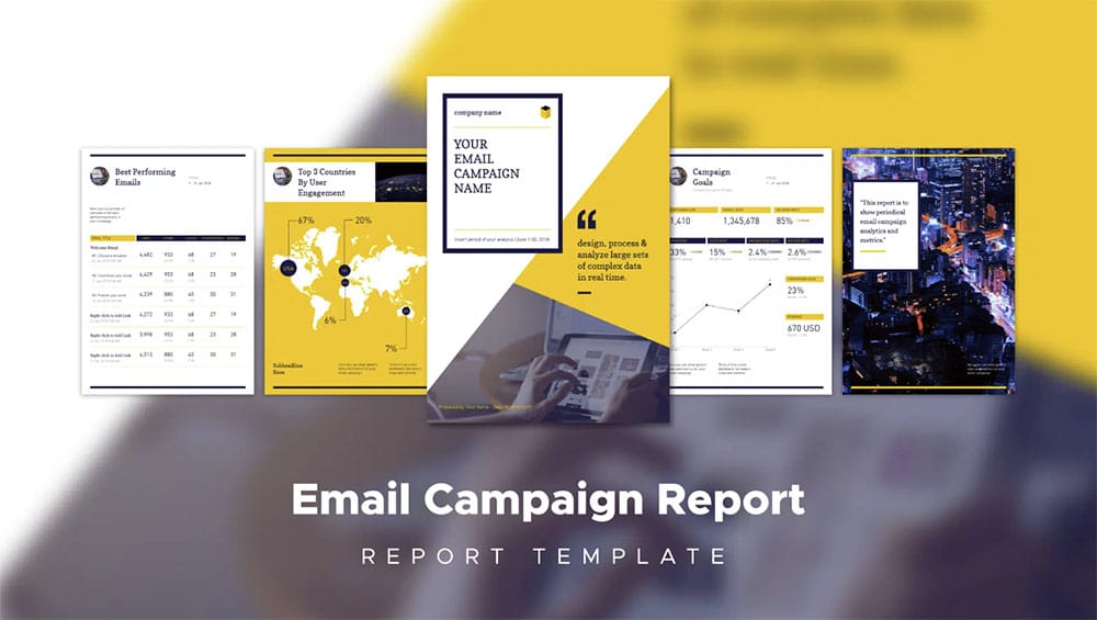
7. email campaign report template.
Create a professional visual without graphic design experience.
Watch this free demo to learn about Piktochart.

Other Posts

Graphic Design Trends 2025: 9 Key Predictions and Practical Applications

What Color is Vermilion? Its Meaning, Code & Combinations

What Color is Amaranth? Its Meaning, Code & Combinations
the intact one
Read MBA, BBA, B.COM Notes
Presentation of Reports
The best way to start that process is to go first to the end of your report. That’s where your conclusions and recommendations are to be found—and where you’re likely to find the most salient parts of your report. Work to pare down the report’s most essential findings. Keep these to as few points as possible.
You should now be ready to build the presentation that will lead you to the conclusion you’ve already established. That means a return to some fundamentals.
Your objective
Start by being clear about your goals. Was your report designed primarily to pass along information-perhaps to bring your audience up-to-date or make them aware of some business issues? Or was it intended as a call to action? What specific response do you want from your audience? The answers to those questions will help shape your presentation. Write down your objective. Make it as clear and concise as you can. Keep it to a few sentences, at most.
Your audience
Know your audience thoroughly. Check for anything that can affect how they’re likely to respond. Find out also what they may be expecting from your report. You’ll have to address in your presentation whatever expectations or preconceived notions your audience may have. (Learn more about audience analysis.)
Your road map
Your best bet is to begin by mapping out the logic underlying the presentation, especially when dealing with extensive and detailed material. Think of this as your road map. It’ll help you stay focused on the key elements of your report—the main ideas and messages, the conclusions, and recommendations. List those points from your report that best support your key messages. You don’t want to get bogged down in more detail than you’ll need in your presentation, so be ruthless in cutting out what you don’t need. Remember: you are not presenting the report; you’re creating a presentation based on the report.
Structure your talk
When you’re dealing with a lengthy report that later will become an oral presentation, it helps to break the material into several distinct parts, based on the structure you’ve defined in your road map. That way, you can address each main idea as an entity, before moving on to the next idea. That’ll help your listeners better comprehend and remember each key idea. Pay attention here to transitions; these should provide a natural link from one idea or section to another. Your transitions can also serve both as a summary of each section and a glimpse of what’s coming next. (More information on transitions here.) With a well-thought-out outline, building the body of your presentation should not pose a great challenge. You should now be able to move on logically, step-by-step, to your conclusion.
Create a strong opener
It’s essential that you begin any presentation with a strong opener. It’s even more essential when your audience thinks it’s about to sit through what could be a long, tedious exposition. You can quickly dispel any such notion with an opener that immediately grabs everyone’s attention. So plan your opening comments carefully. Find something in the report—a statement, a claim, a conclusion—that’s likely to have a particular impact on this audience. That may require no more than going straight to the report’s key conclusion, and stating it as concisely as you can. You may want to think of an elevator speech. Imagine you’ve got 10 seconds to make your pitch. What would you say? Once you’ve got the opener down cold, you can move on smoothly to the body of your presentation. (Read our article on great openings.)
Keep those visuals lean and mean
Chances are your report contains lots of detailed data. Be on the alert to include only the most essential data in your visuals. As you create your visuals, keep in mind the fundamental rules. Use only at-a-glance visuals that support your key messages. As much as possible, avoid visuals crowded with lots of data, charts, and graphs that add nothing of real value. Here again, you’ll need to be somewhat ruthless in cutting out all but the must essential material. (Read more about creating effective visuals.)
- Be clear about the time allotted for your presentation.
- At the end of your presentation, summarize clearly and emphatically the key conclusions and recommendations of your report.
- Be prepared for questions. Will you be addressing questions as they come up or will questions be held for a Q&A period at the end?
- Have back-up material in reserve in case you’re questioned or challenged about parts of the report you did not include in your presentation.
- Have handouts ready to pass around after your presentation. You may decide to hand out the entire report or just portions of it, as appropriate.
- Rehearse in the room and with the equipment you’ll be using.
Remember, your report was compiled as a report. Your job now is to create a successful presentation. That means you’ll be needing everything in the presenter’s toolkit, including practicing your non-verbal communication skills as well like maintaining eye focus and using your voice and gestures to good effect.
Share this:
You might also like, pivot table, system development life cycle: investigation, analysis, design, 2 thoughts on “ presentation of reports ”.
- Pingback: BBAN105 Business Communication – Home | Management
- Pingback: CCSU(B.COM) C-101 Business Communication – Home | Management
Leave a Reply Cancel reply
How to Create an Outstanding Report Presentation!
A report presentation is a daily necessity for most companies. Employees are constantly working on compiling data and facts about their company and department and presenting them in PowerPoint presentations. But often, the presentation design fails to impress.
In this article, you’ll learn how to visualize hard data into an appealing and engaging report presentation for your audience.
What exactly is a report?
A business report is a formal document that communicates corporate information clearly and concisely .
In a report presentation, a company presents data, facts and information, quarterly balance sheets, turnover, HR developments , and so on.
Why report presentations are so important
Report presentations are essential to the success of your business . Why? It’s simple.
Report presentations provide a coherent overview of your company’s performance : What is the current status quo? Which strategic decisions need to be made in the future? How are resources being allocated?
This clear presentation forms the basis for future fact-based decisions . This means it must present facts transparently and answer any business-related questions .
What does a good report presentation look like?
A report presentation has to be clear and concise – after all, you want your audience to understand what you’re saying.
Reporting on data is often very dry. You need to present it in the most visually interesting way possible . An attractive report design will help your audience understand your key messages immediately, without having to delve into specific corporate figures . Keep reading for tips on how to do this.
How to create an engaging report presentation: 5 tips
Report presentations are usually time-limited, so focus on the essential information . The key is to communicate facts clearly and concisely .
Give your information visual interest. Microsoft PowerPoint offers numerous possibilities for enhancing the look of your presentation. Below we have compiled 5 tips for you on how to create an appealing report.
Tip 1: Prepare properly

Preparation lays the foundation for a successful report presentation. Think carefully about how you want to present specific facts and data. Know what you want to say and what your goals are – that’s key for a great report presentation layout. Each slide must have a specific purpose . Only include data that is essential to convey your message .
Give your slides variety but don’t overload them with information or graphics. Less is often more. Try out the unique features of PowerPoint and see which option best suits your presentation.
Focus on the most important key figures and avoid unnecessary details . A good report presentation should make your key statements understandable without your audience having to delve deeper into the company’s key figures.
For 11 helpful tips on preparing your presentations, check out our post, Preparing a PowerPoint Presentation .
Tip 2: Chose the right charts and diagrams
Charts and diagrams are the best way to visualize figures and data. Not only are they visually appealing, but they also summarize your statements in a way that is easy to understand .
PowerPoint offers a wide range of charts and diagrams . You can choose from pie charts, bar charts and area charts, as well as other customizable diagram options. We’ve summarized an overview of the best diagram styles and when to use them in our article, 10 Chart Types: Which One Is Right for My Data?
Some chart types are more suited to specific data . For example, a pie chart is a terrific way to show gender distribution in your company. Bar or column charts can be used to visualize sales, balance sheets and profits.
If you want to illustrate aspects that have happened over a longer period of time, area charts, line charts and of course timelines are ideal.
Feel free to combine several chart types . Let your creativity run free. You can also add icons to your diagrams. The possibilities are endless! Just keep it simple and don’t overload your slides. You can find professionally designed icons in our shop . Take a look at these:
Once you’ve found the right type of chart or diagram, it’s time to highlight the most vital information in it . This helps your audience understand your key messages and quickly identify the most important aspects of your report presentation. If you need to, you can further explain these aspects as you go along.
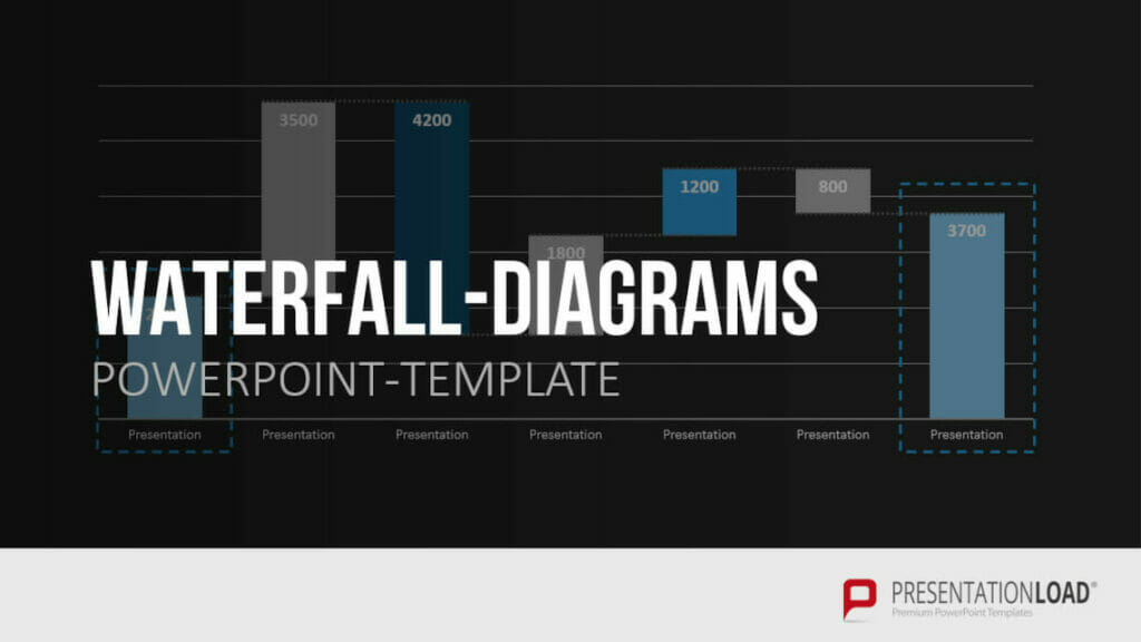
You’ll find professionally designed slide templates for various charts in our shop . For example, this template:
Tip 3: Reuse layouts
Certain topics often reappear in report presentations. A good example of this is quarterly figures or annual financial statements. With these kinds of topics, it makes sense to the invest time in creating an optimal layout that you can reuse .
If you want to compare quarterly figures or annual financial statements, using the same layout makes any differences clear and obvious to your audience.
You can find out how to create your own layouts and other tips & tricks here .
Tip 4: Other design elements
You can also use additional design elements to enhance your report presentation . There are unlimited, creative options to choose from. Think carefully about which elements will visually support your statements.
Try to include transparent images . These are more attractive than normal images and set visual accents when combined with text or graphics. Transparent images are also effective as customized backgrounds, like on title slides. We’ve put together more information on transparent images for you here .
Another design idea is icons . These small images help to break up blocks of text and reduce presentation content to a bare minimum. The simple messages behind icons are universally understood and save space on slides. More information can be found here .
Tip 5: Practice, practice, practice
Ideally, a report presentation should need little accompanying information – your slides should speak for themselves . But that doesn’t mean you don’t need to practice. Especially with diagrams, extra information can further support the infographics. Put particular focus on getting your key messages across.
Think about any questions that your audience may have. Even when your report presentation covers only key content, it’s still important to know and convey more in-depth background information on data, facts and figures in case of follow-up questions .
Of course, there’s so much more that goes into a convincing presentation. Here are some articles with helpful tips:
- 16 Ways to Kick-Start Your Presentation
- Body Language in PPT Presentations: 8 Tips & Tricks
- Rhetoric Skills: How to Speak and Present Effectively
- Presentation Hack: Always Focus on Your Audience’s Needs
- Because First Impressions Aren’t Everything: 20 Tips and Ideas to End Your Presentation in Style
You can find more helpful articles in our blog. ► To the blog
Create expert report presentations
Report presentations are a common part of day-to-day business. With their clear graphic elements, reports communicate unambiguous information that is essential for a company’s success.
No doubt your next report presentation is already in your business calendar. Take our tips to heart and try them in your next report.
Do you have questions about report presentations or general questions about PowerPoint? Feel free to contact us at [email protected] . We’re here to help!
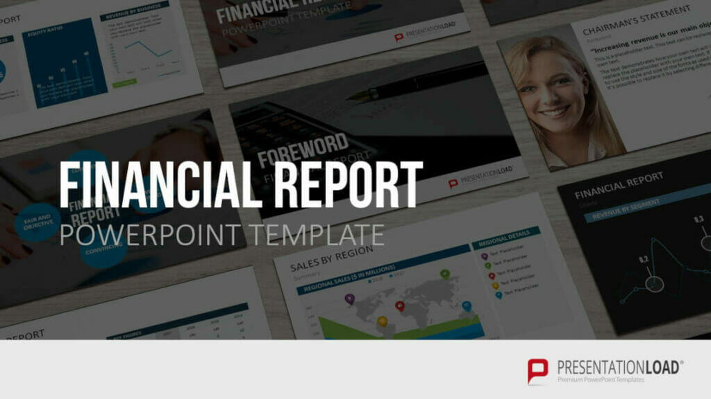
Are you looking for professionally designed slide templates for your report presentation? Take a look around our shop. We have a wide variety of slide templates on numerous (business) topics. You’re sure to find the right slide set for your needs. For example, here’s one for your financial report:
You can find more templates here ► To the shop
These articles might also interest you:
- The Right Way to Use Pie Charts in PowerPoint
- PowerPoint Layout: Tips & Tricks Plus 6 Modern Ideas for Your Slide Layout!
- Make a PowerPoint Image Transparent: The Pro Guide
- Icons: An Amazing Way to Improve Your Content
- Preparing a PowerPoint Presentation: 11 Tips for Guaranteed Success!
- 10 Chart Types: Which One Is Right for My Data?
Share this post
- share
- save

Design Thinking: Problem Solving with a Difference

Why Corporate Mission Statements Are So Important

7 Tips & Learnings from the Apple Keynote

IMAGES
COMMENTS
May 31, 2024 · Typical use cases of these report presentations are project meetings, status updates, and post-project reviews. Progress slide in a Project Report Presentation. Slide created using the Generic Progress Report Presentation Template. To create a slide deck for project report presentations, consider to include these slides:
Aug 30, 2023 · ƒÿ_ …}ˆQHMê ÐHY8 ÿ >ç}ùªùßçŸ/ ™¡±9 –“N ¤kÅ¥¾Æp2 ¹ aC ,¥Ó#ñ·Ìª?g^N”3²eu Èò" k[âGokÚS ¤'™N 4B¶\ ~Ìéðÿý2ÿ¿¯Zö ...
%PDF-1.5 %âãÏÓ 43 0 obj > endobj xref 43 17 0000000016 00000 n 0000000931 00000 n 0000000636 00000 n 0000001024 00000 n 0000001065 00000 n 0000001194 00000 n 0000001300 00000 n 0000001823 00000 n 0000001985 00000 n 0000002445 00000 n 0000002712 00000 n 0000002965 00000 n 0000003224 00000 n 0000003325 00000 n 0000004976 00000 n 0000037953 00000 n 0000046530 00000 n trailer ...
Jun 21, 2024 · Remember: you are not presenting the report; you’re creating a presentation based on the report. Structure your talk When you’re dealing with a lengthy report that later will become an oral presentation, it helps to break the material into several distinct parts, based on the structure you’ve defined in your road map.
How to create an engaging report presentation: 5 tips. Report presentations are usually time-limited, so focus on the essential information. The key is to communicate facts clearly and concisely. Give your information visual interest. Microsoft PowerPoint offers numerous possibilities for enhancing the look of your presentation.
Aug 13, 2015 · Written presentations are far more detailed than oral presentations. Oral presentations are often done with presentation software like PowerPoint. Oral presentations cannot cover all of the details covered in the written presentations. There is simply not enough time to read the entire report at a presentation.